Work from 2021
Before getting stuck into this project, I carried out some research into the banking world so that I would be well informed on the industry I was designing for. This included research into specific current bank brands. I used the tools of user personas, empathy maps and interviews which helped me get into the heads of my target audience.

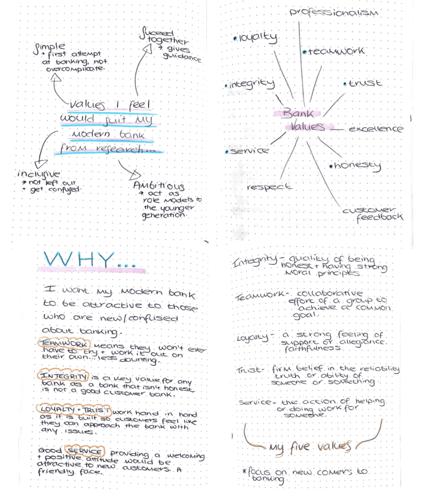
My research put me in a better position to start brainstorming ideas for my brand values. I looked at the common values all banks need and combined them with other ones I felt would suit my brand, which I had decided would be targeted towards newcomers to the banking world.
The IxD 103 module focused on branding. I was introduced to the steps needed to build a brand from scratch, which I used to create a commercial brand for a modern banking app. This ranged from brand values to brand guidelines to the app dashboard.

It was during the design process for my wordmark that I decided to change some of my values. I swapped loyalty with positivity as I felt providing a positive atmosphere would be more important to new customers. Loyalty would be more applicable to customers who have maybe been with a bank for a number of years.
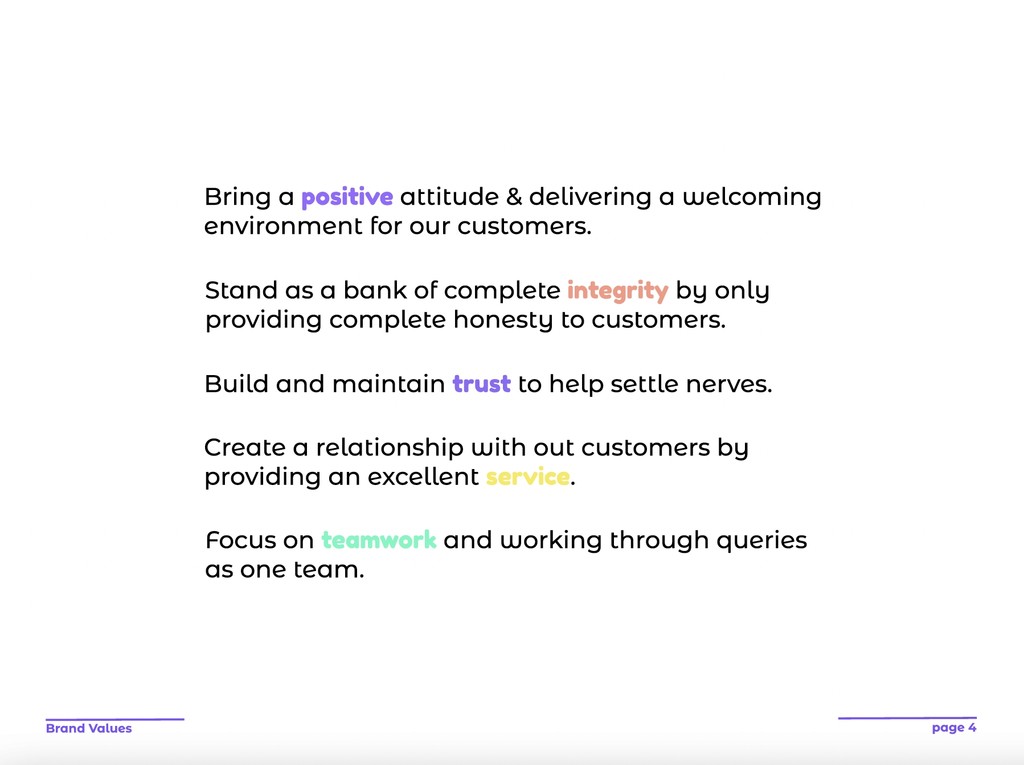
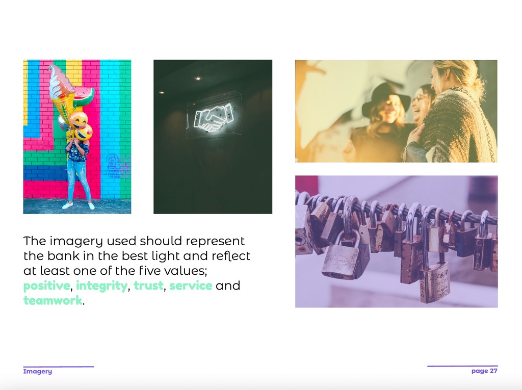
Positivity - Integrity - Trust - Service - Teamwork
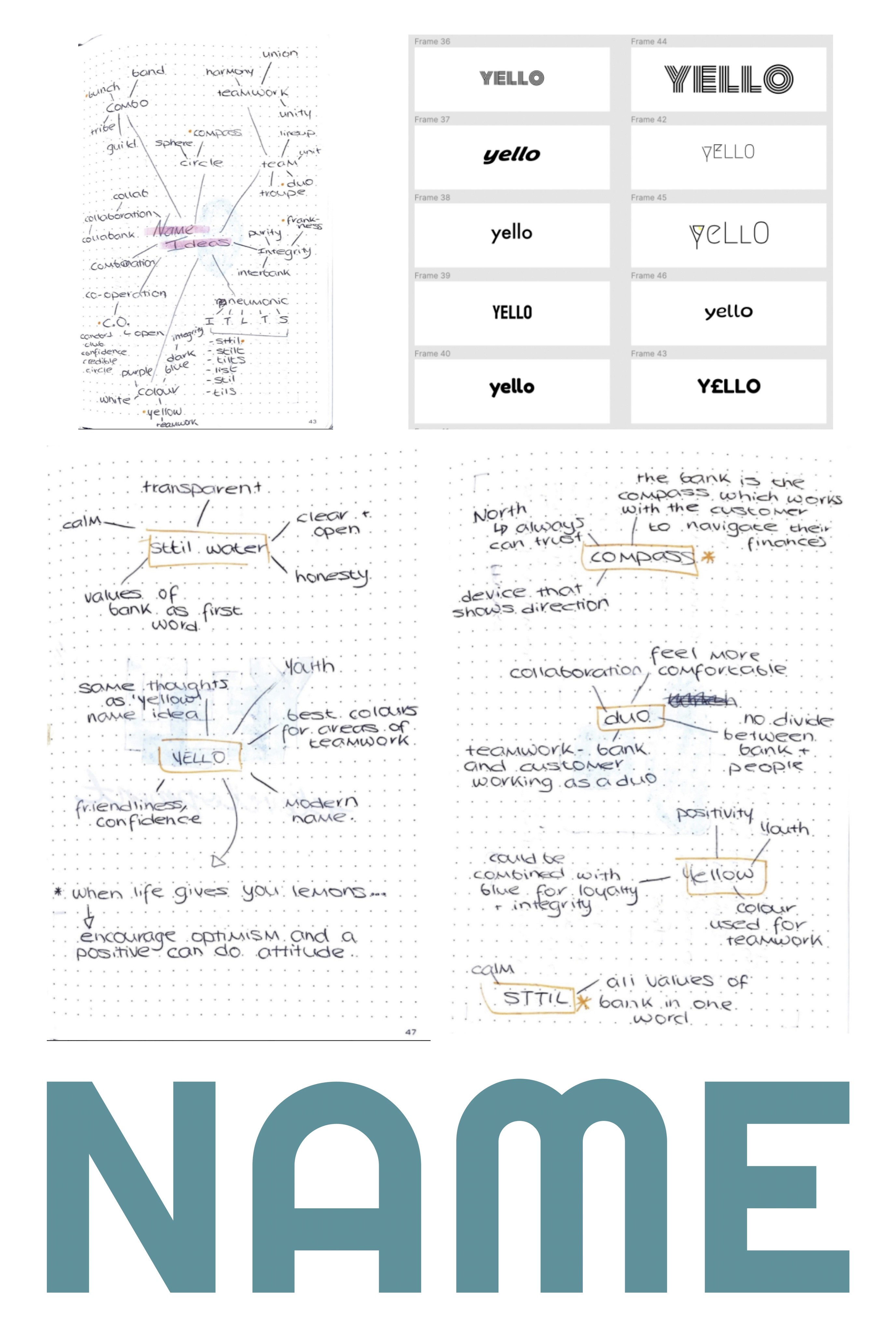

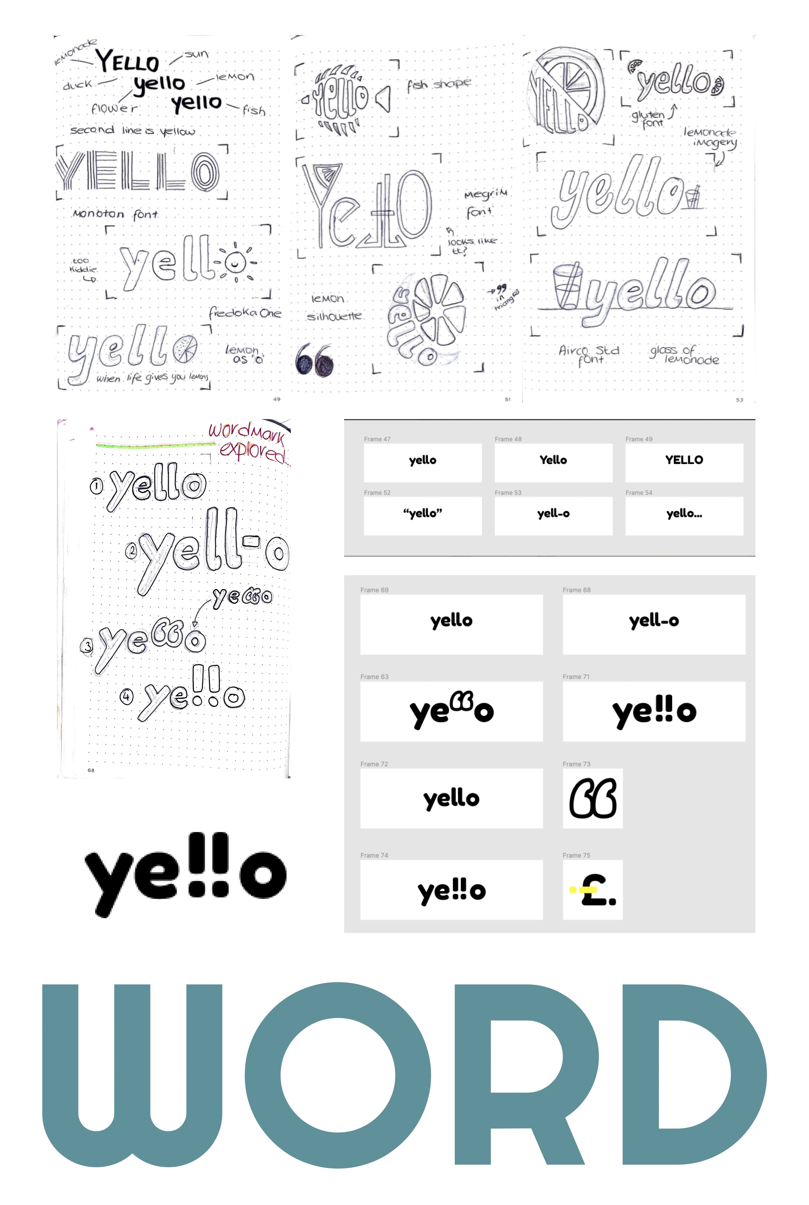
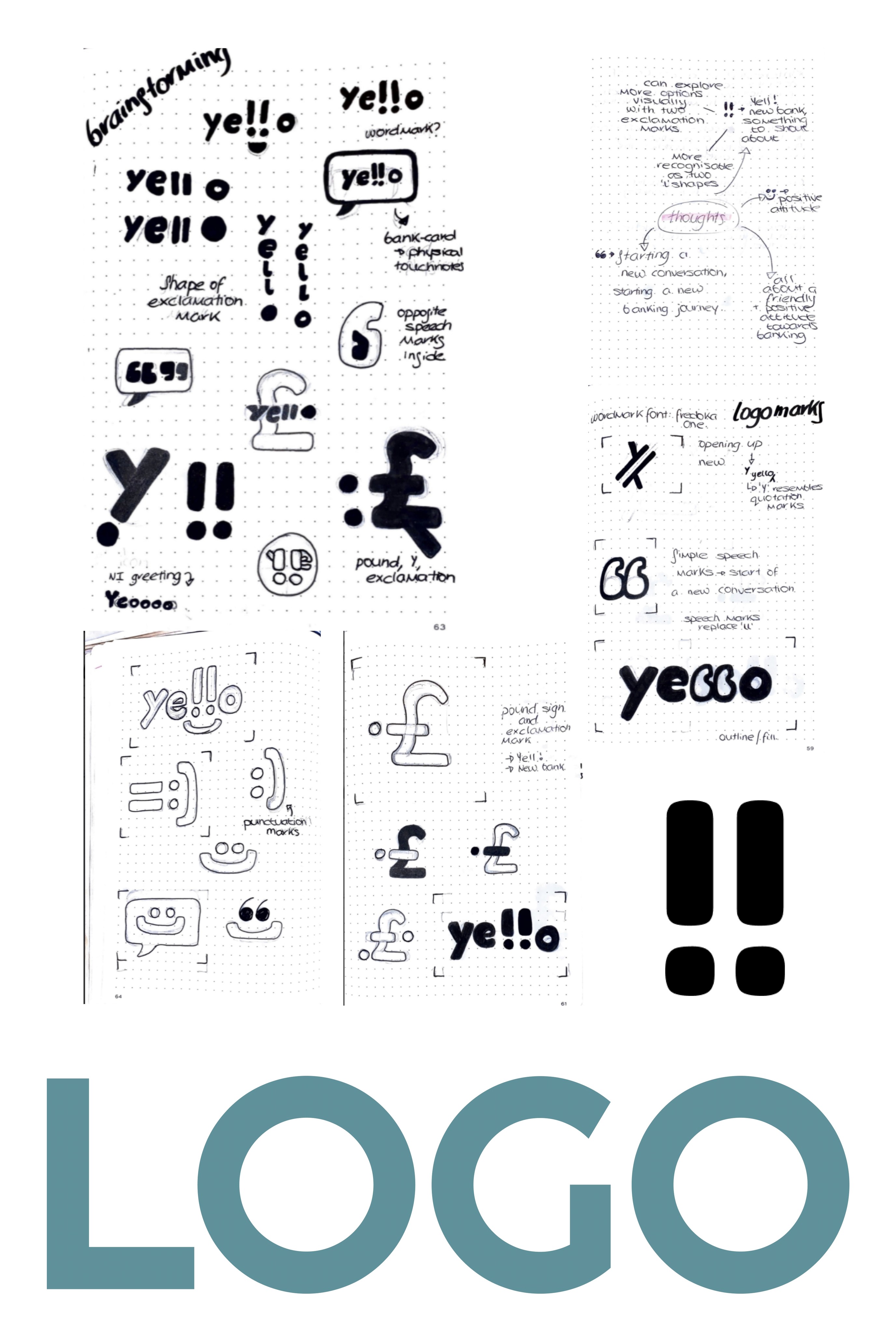
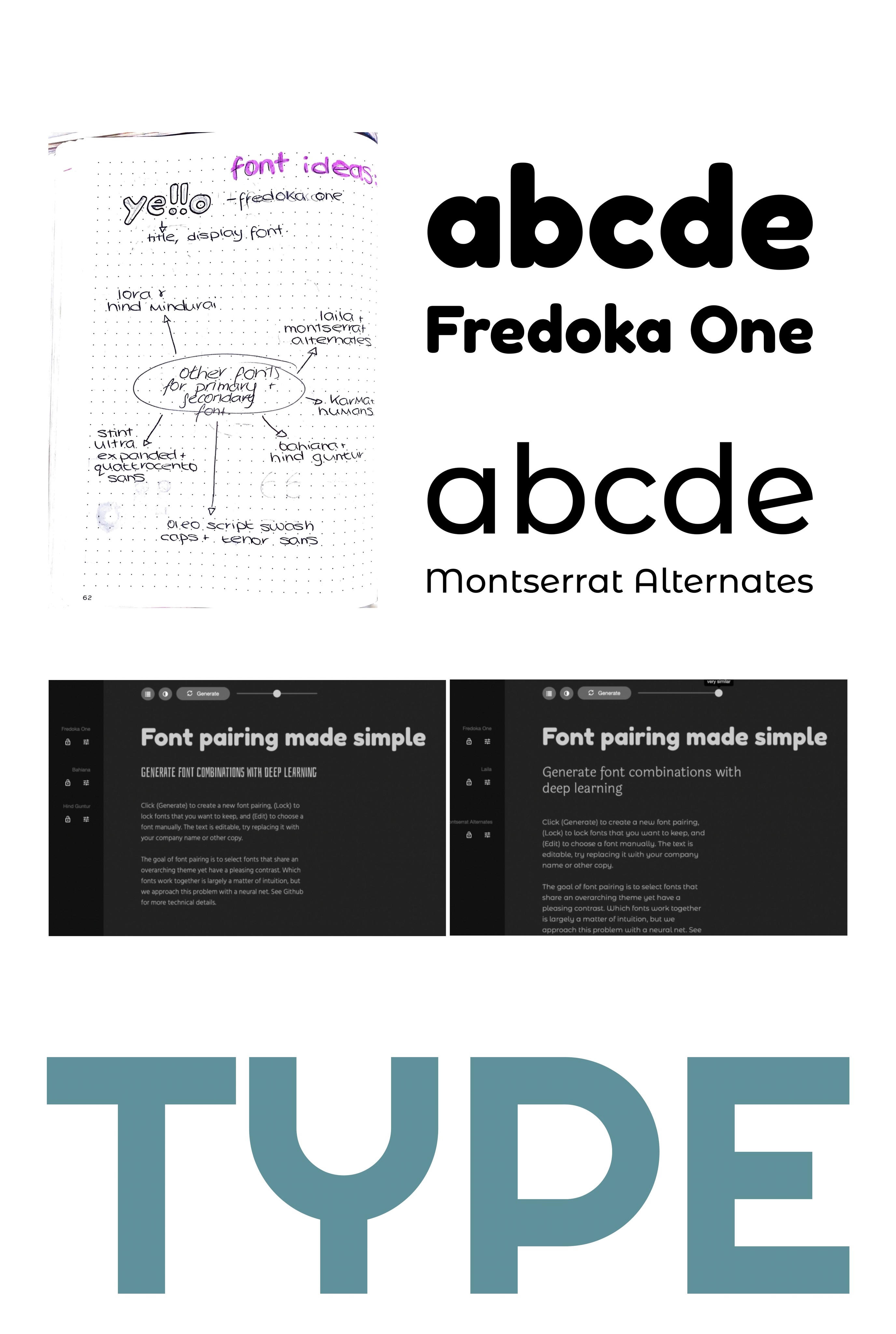


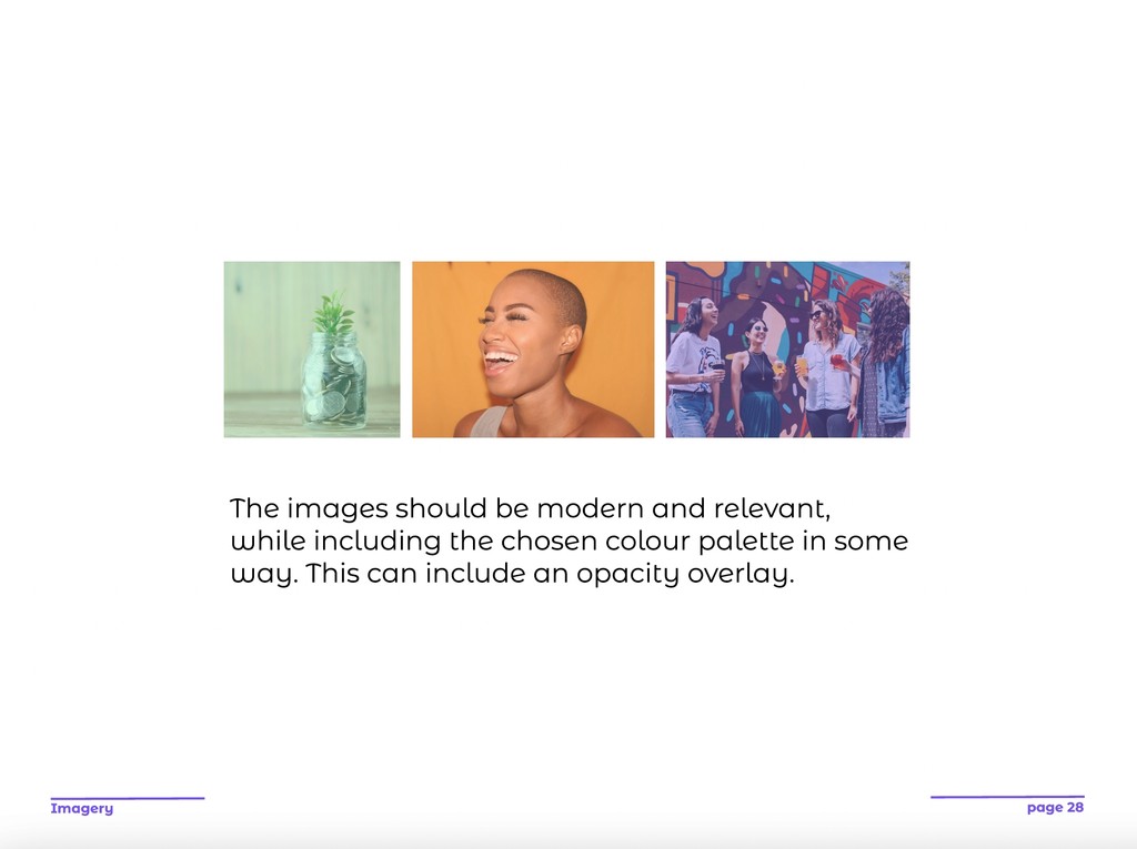
Once my values were in place, my next step was to look at the different parts that would build my brand. This included the name, typography, logomark and wordmark, colour, imagery, and icons.
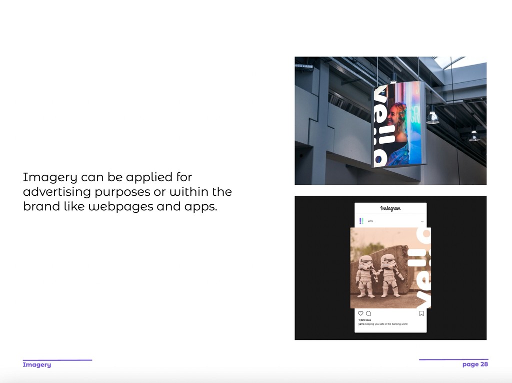
Once I was confident with my brand, I looked at where I could apply it and what touchpoints would be suitable. I brainstormed ideas focusing on modern methods like social media and phones as my target audience is young. A bank card is the first obvious choice for my banking brand.
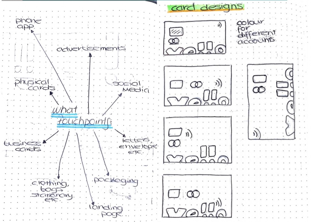

I created mockups of my chosen touchpoints which would best suit my brand. I utilised the wordmark and colour specifically in the card designs. As it is a modern brand, physical cards weren’t the only option available so I looked at Apple Pay. I wanted to create a fun and positive tone in the social media posts, so I chose imagery accordingly.
Before I began constructing my brand guidelines, I researched into other brands like Urban Outfitters and Leinster Rugby, who had brand guidelines with a similar aesthetic to how I wanted to create my own.
I sketched out the order of the pages and simple wireframes looking at the layout. At this point I also considered the design of the guidelines and how it would relate back to my brand. I planned to do this through colour and typography.
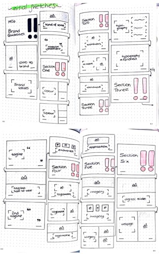


This process surprised me in how long it took and the amount of detail that had to be considered. Though I can see how it is a vital tool for designers when designing for a brand. Using my sketches, I created a set of guidelines which I feel are cohesive and show the modern approach of a banking brand I took in this project.
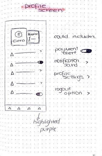
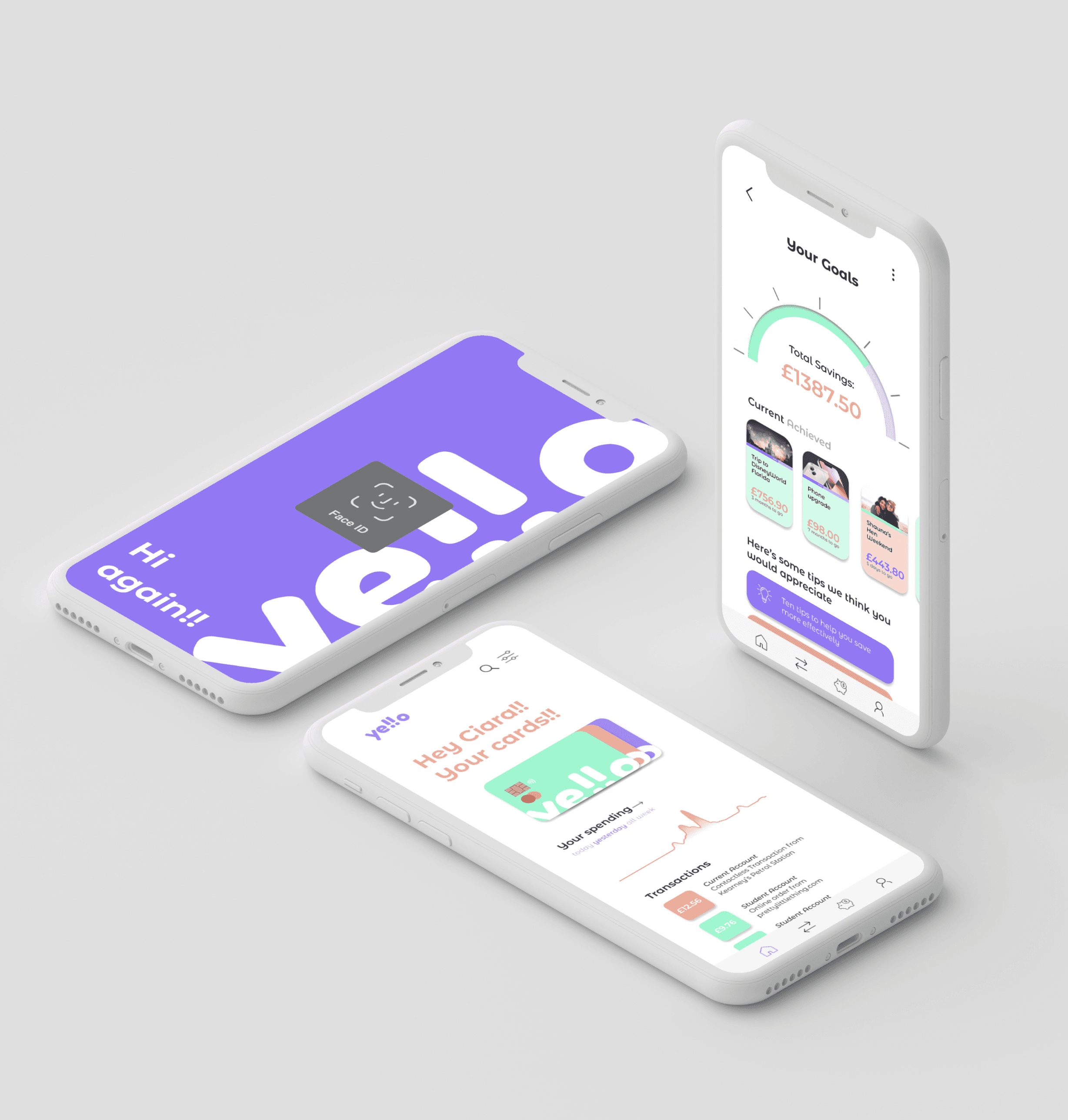
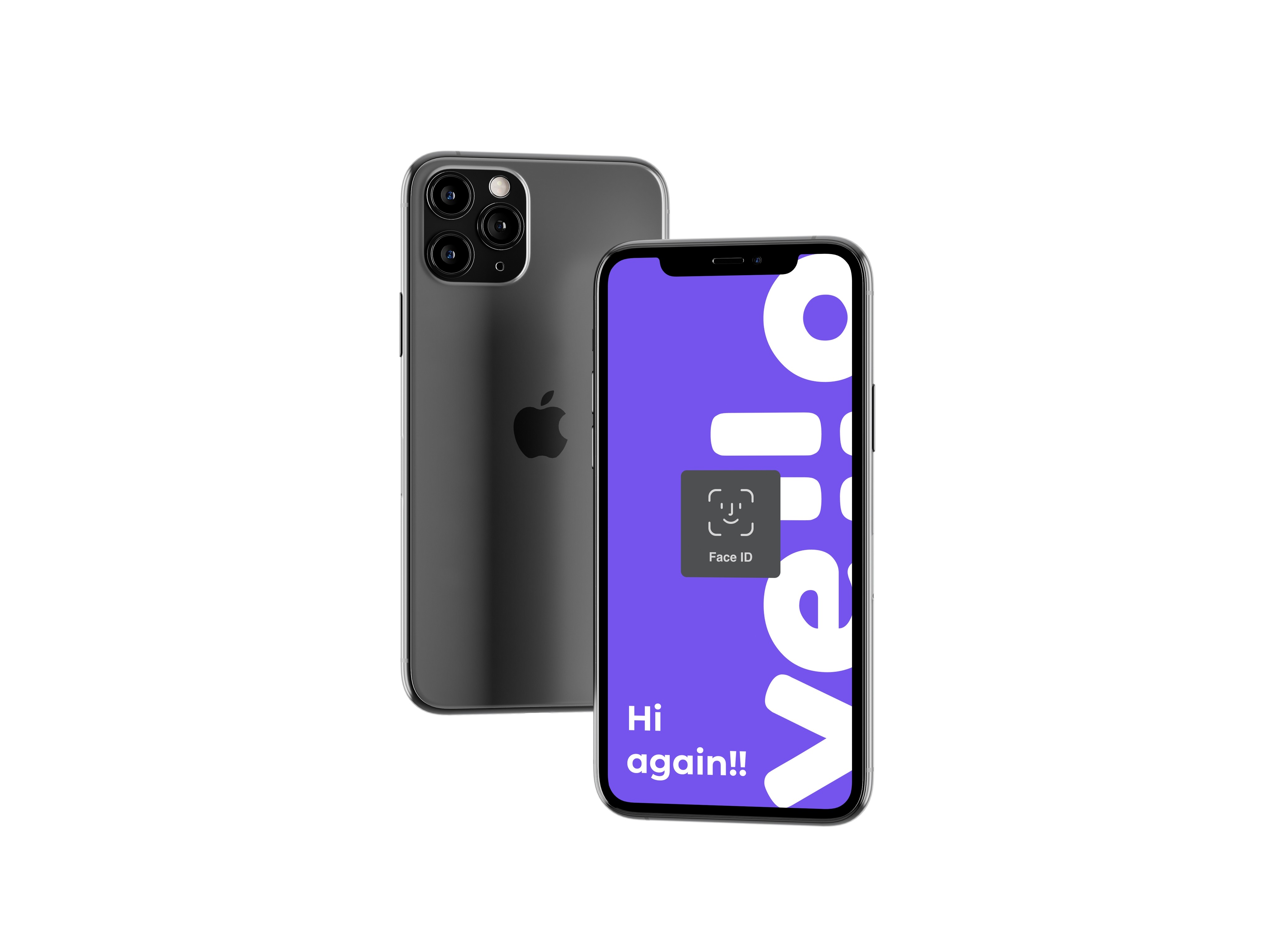
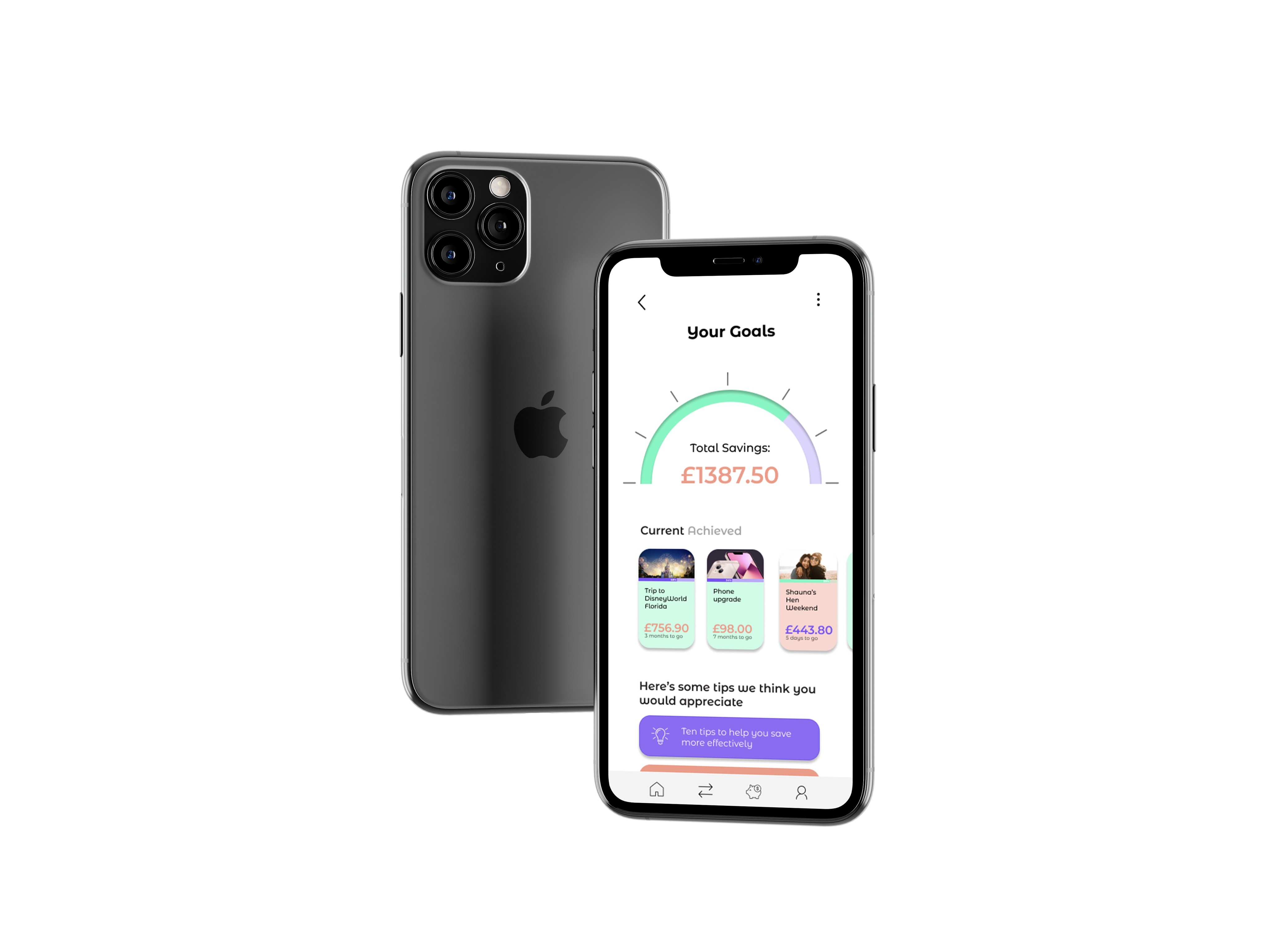
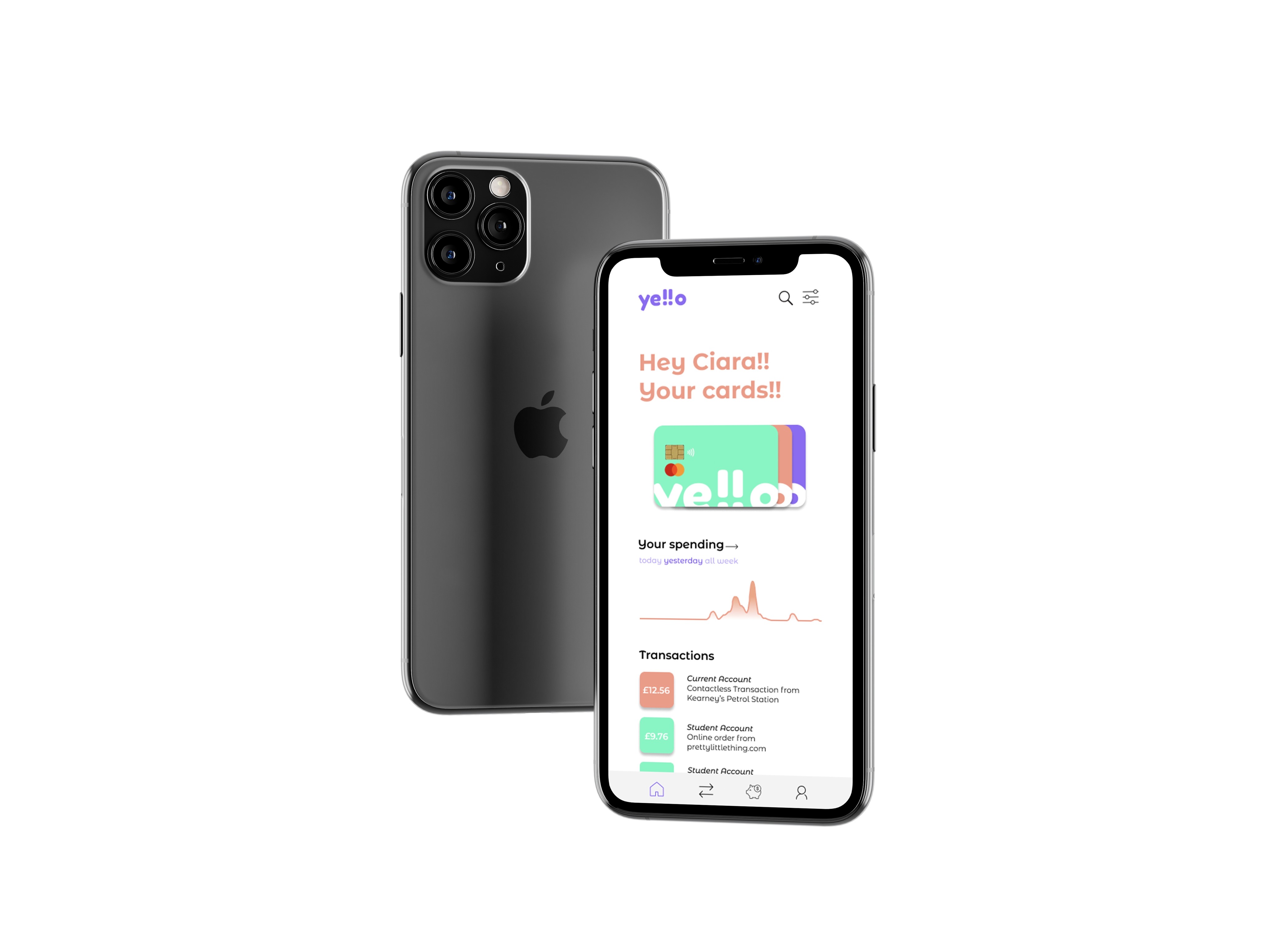
After my brand guidelines were finalised, I moved onto sketching out ideas for my banking app dashboard. My aim was to keep it simple and easy to understand, in keeping with my brand values. So I decided to include a tips option and only include information that was absolutely necessary.

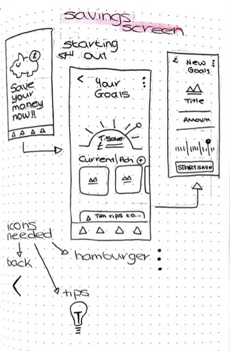
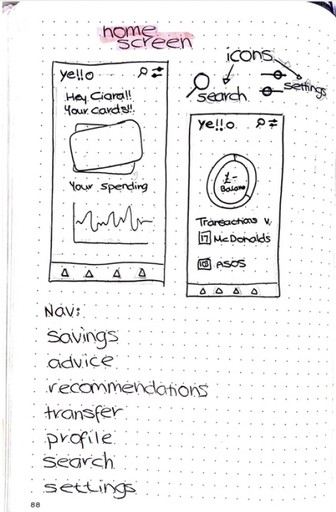


I created the opening, home and savings dashboards as I felt they would show the main aspects of the app, both how it would look and what it has to offer. I took a similar approach to the brand guidelines keeping a white background and using the colour scheme to bring the app to life.
As with any project I faced some challenges along the way. My main one was trying to wrap my head around the banking world as I didn’t have a lot of experience with it before this project. While the research was time consuming at the beginning, it benefited me massively when it came to the design as I knew what my target audience wanted. But also what is usually included in a banking brand/app, and what maybe shouldn’t be. Overall I feel I completed this project successfully as all the different aspects relate to each other visually and through the tone of voice and aims.