Work from 2021
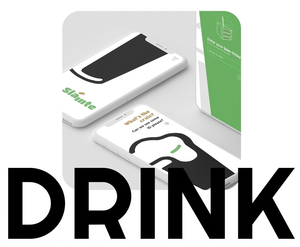
In IXD 101 I was tasked with designing a travel app on any subject. The journey of this project took two routes, where I had to have a rethink and redesign. This was a challenge but also rewarding. I took the approach of creating a travel app where people could go and try and review all the pints of Guinness across Ireland.
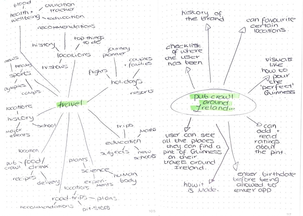
As with any project I began brainstorming any initial ideas I had. The first challenge I had to overcome was picking a singluar focus, when travel is so broad. I knew initally I wanted to keep it within Ireland as I could explore local places and also would be an app that I could possibly use myself. I used mindmaps to narrow down to my final concept of an app that would facilitate a digital and physical ‘pub crawl’ around Ireland.


After creating my initial sketches I felt the overall look of my app wasn’t as cohesive and successful as I had hoped. So I decided to take a step back and go back to my sketchbook and look at the project from a different approach.
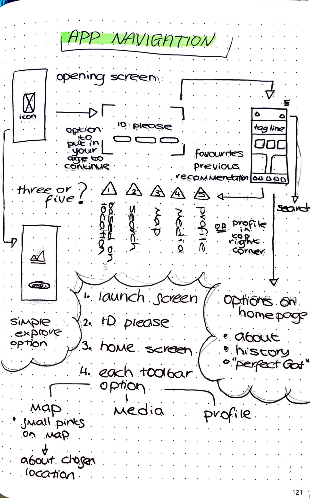
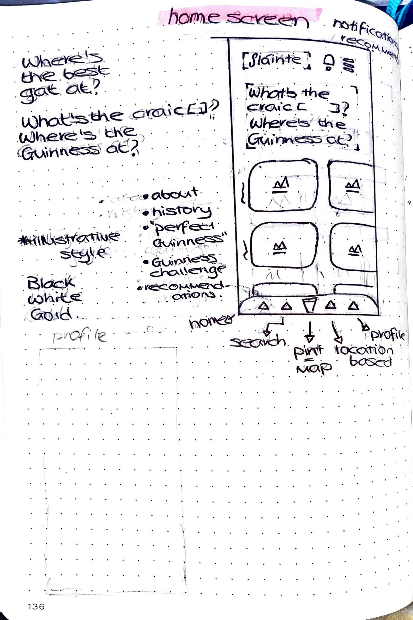
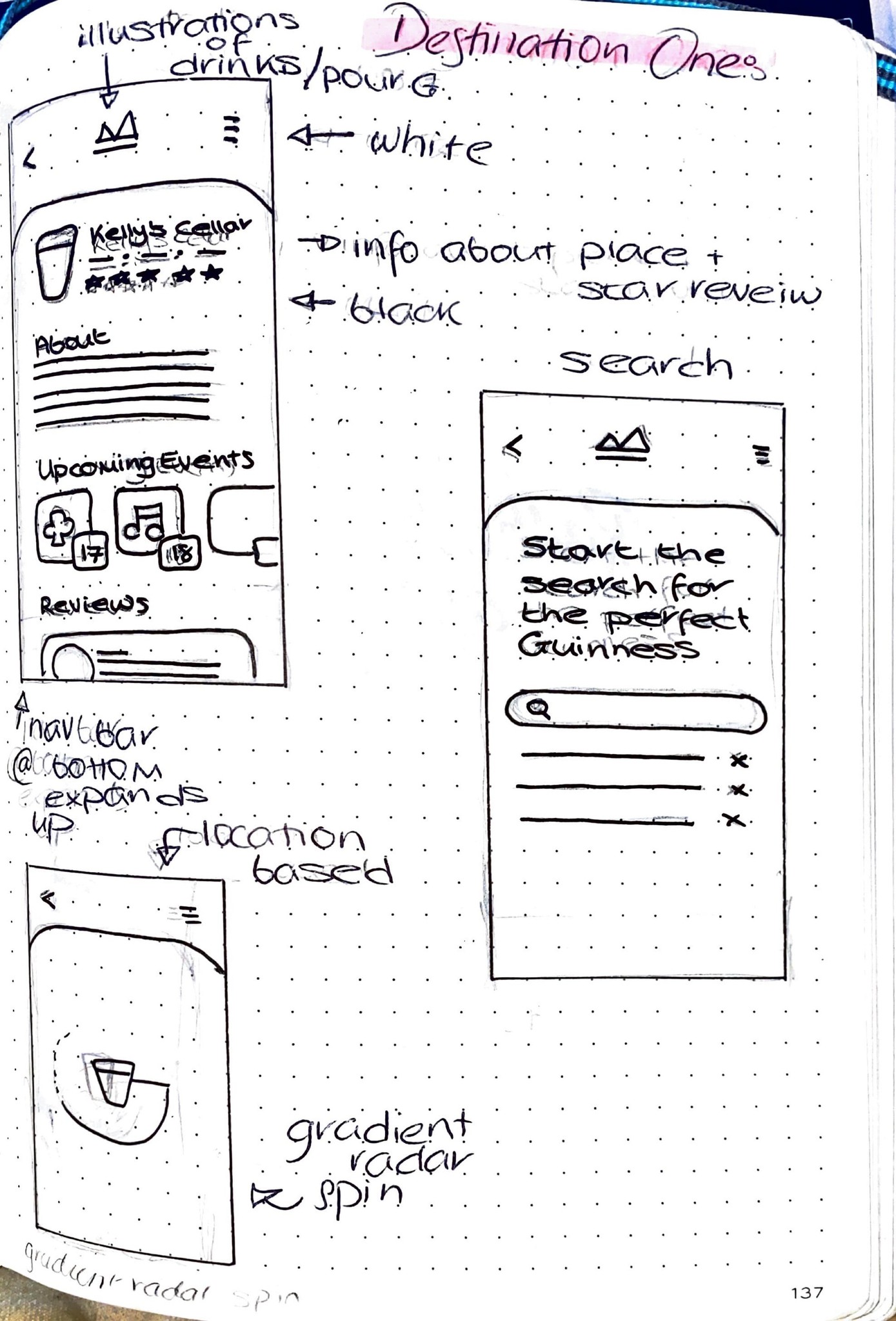
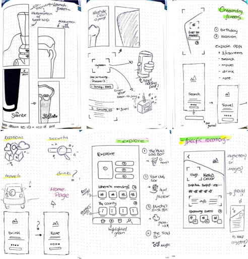
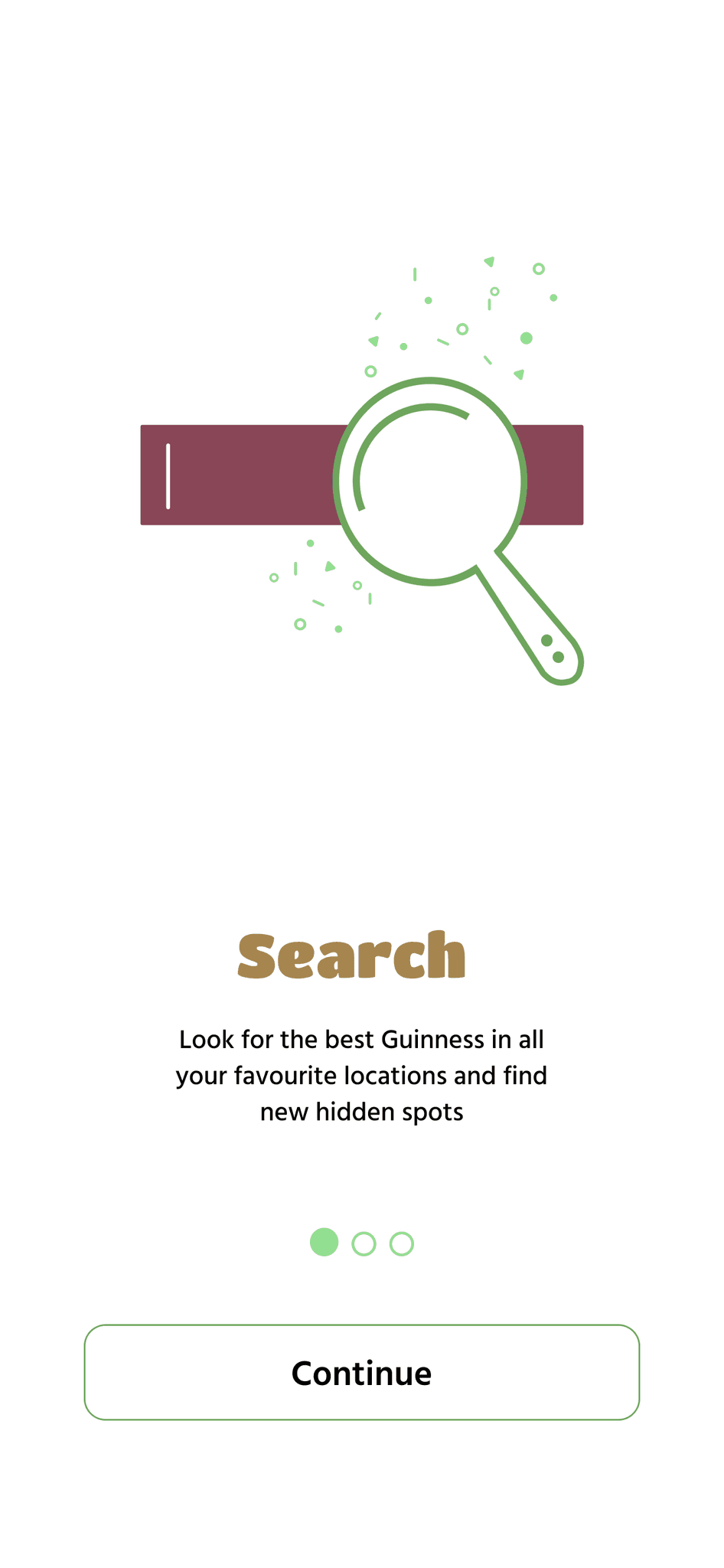
I wanted to challenge myself with this project and took a more illustrative approach with my travel app. I looked at different angles, onboarding and individual location screens. At this point I wasn’t particularly focused on the details, but more on the structure and architecture of the screens.
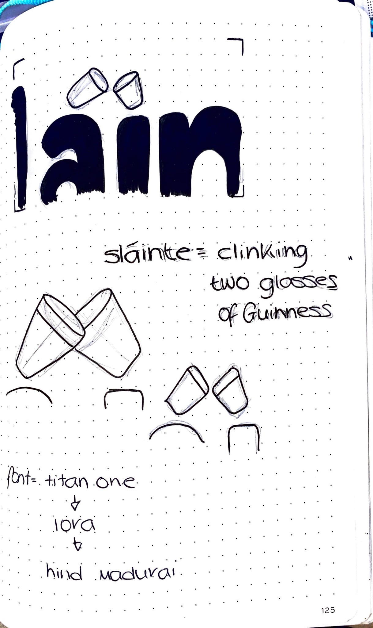
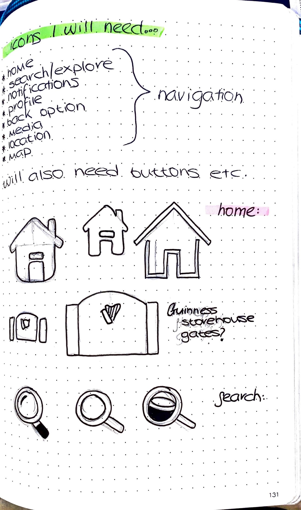
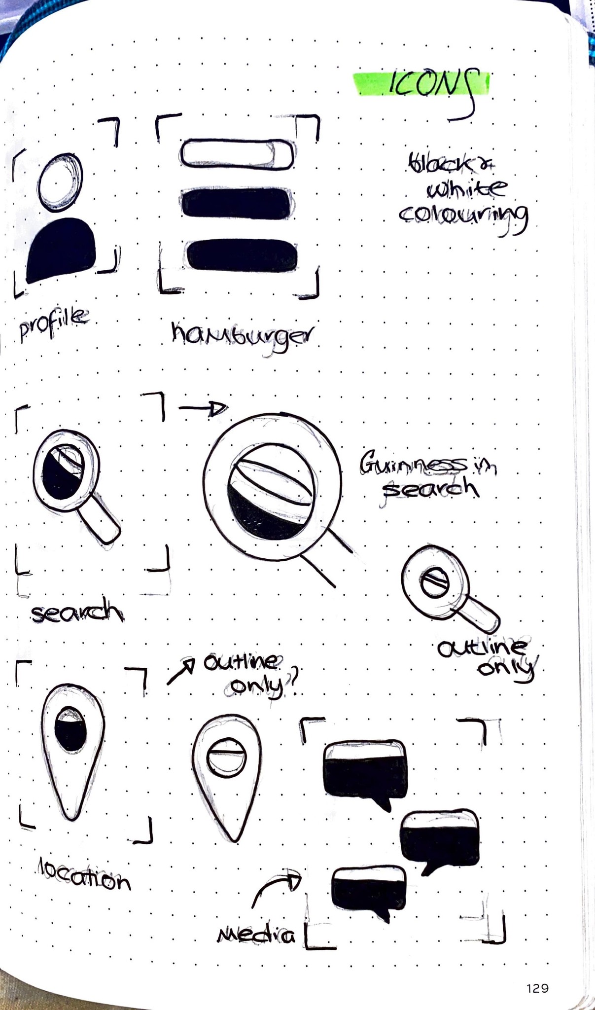
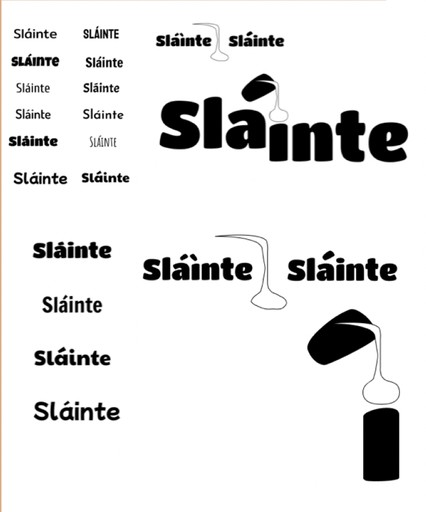
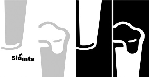
Moving onto Figma I began creating wireframes and components for my app dashboards. I also explored my wordmark and typography, in particular the concept of the fada becoming a pint glass.
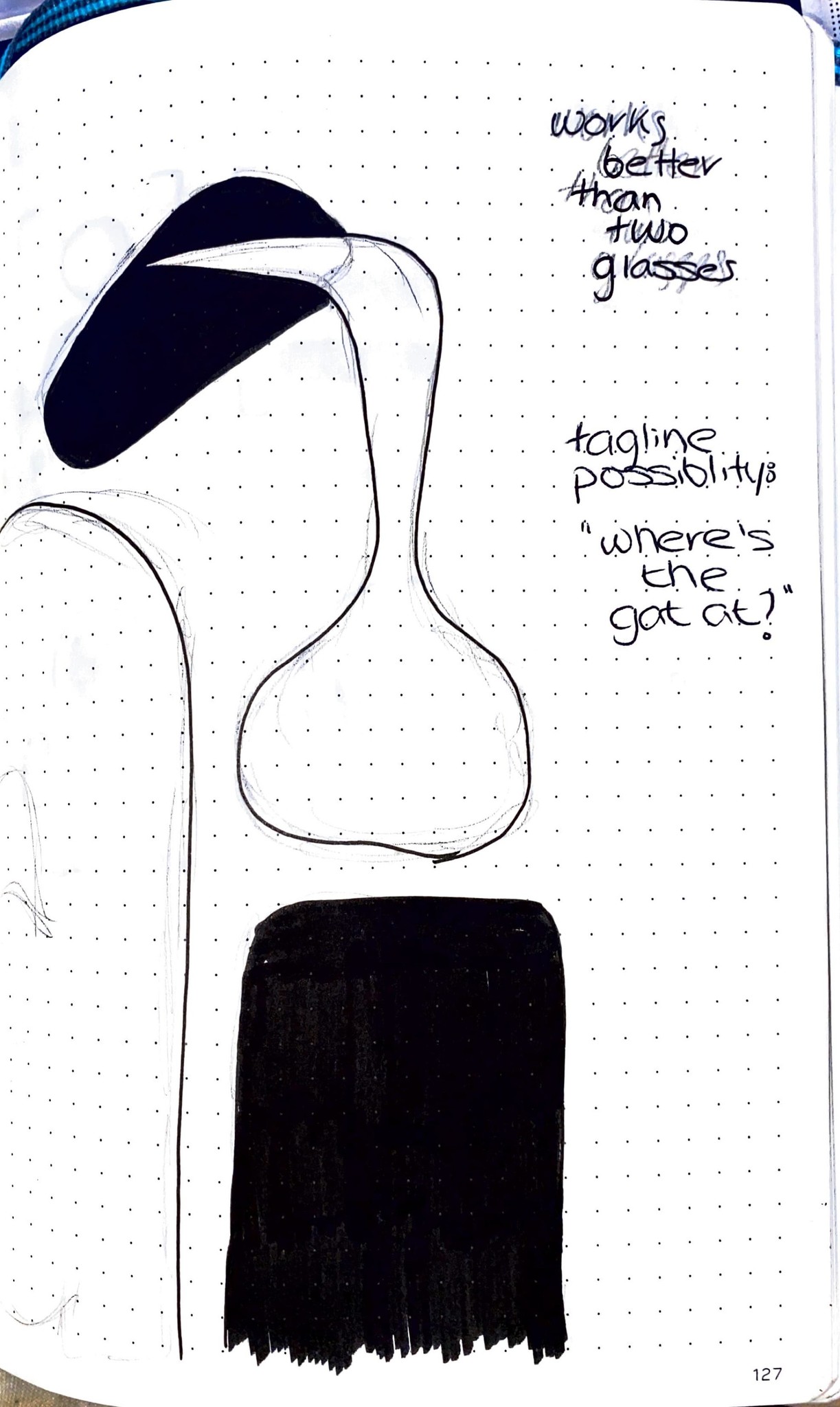
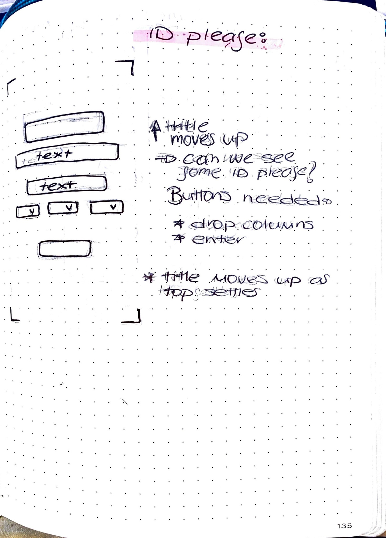
I wanted the idea of a Guinness settling to be included, as it is a well known feature of the drink. I incorporated it into the navigation of the opening screen; the user would scroll down and the top is where the ID process would start.
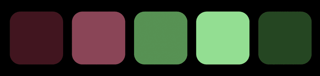
No app is good in purely black and white, so using Adobe Colour I created my colour palette, with green being the primary colour. Initially, I wanted my colour scheme to be linked with the Guinness, but I felt taking the ‘Irish’ approach with green would be more effective.


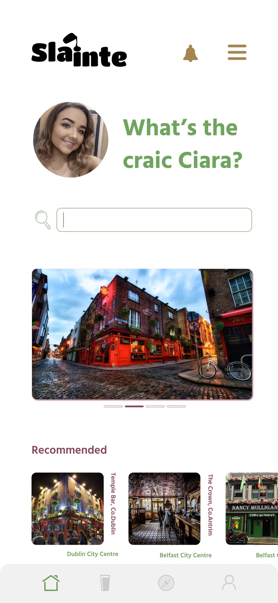
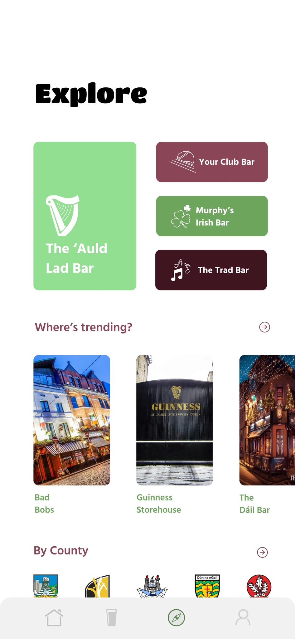

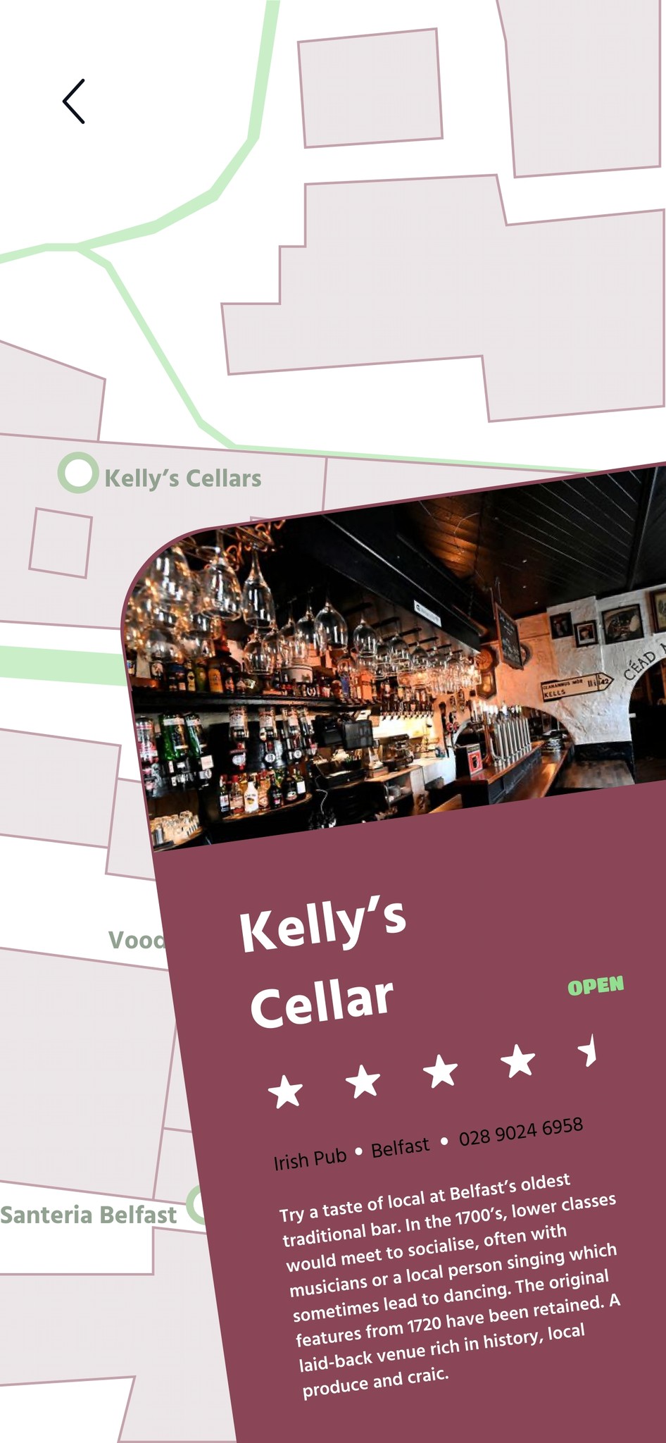
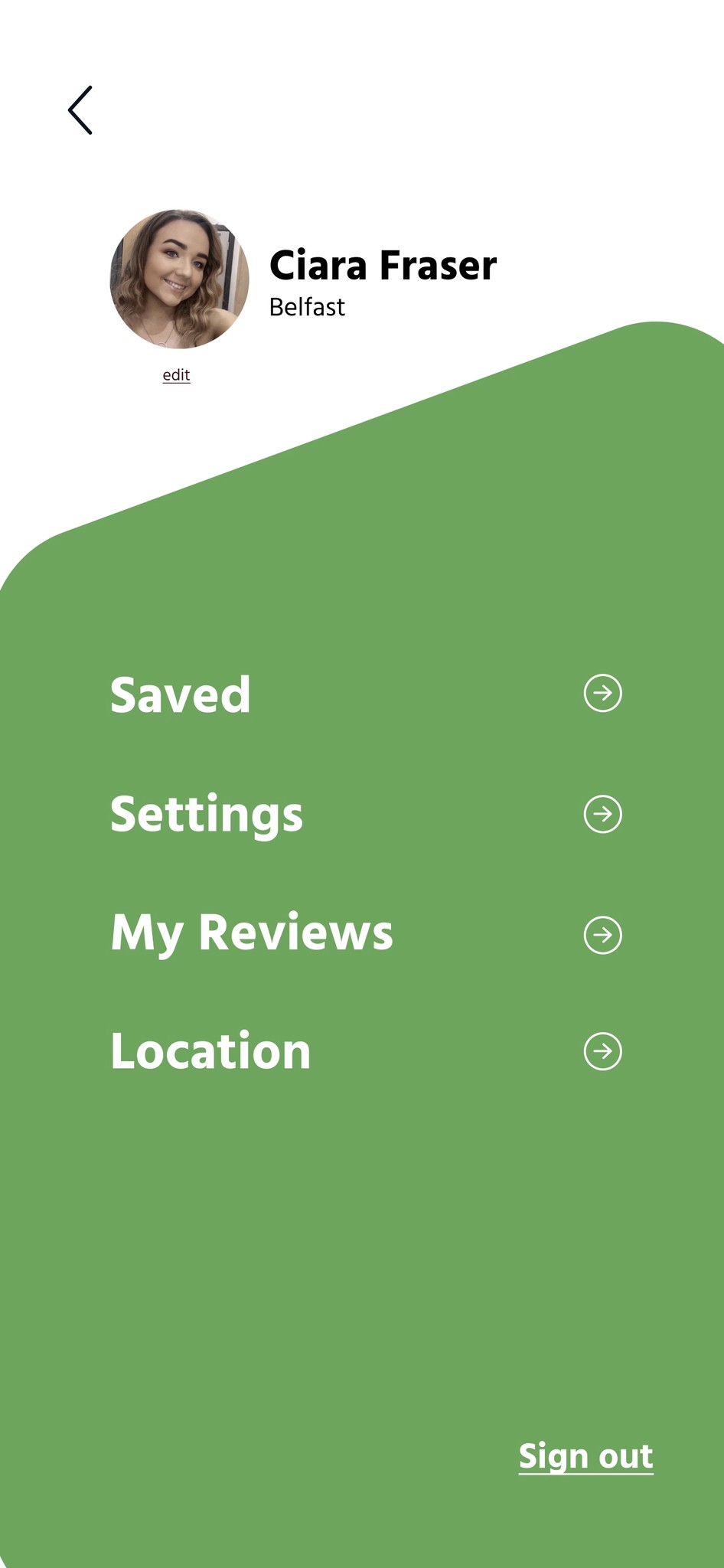

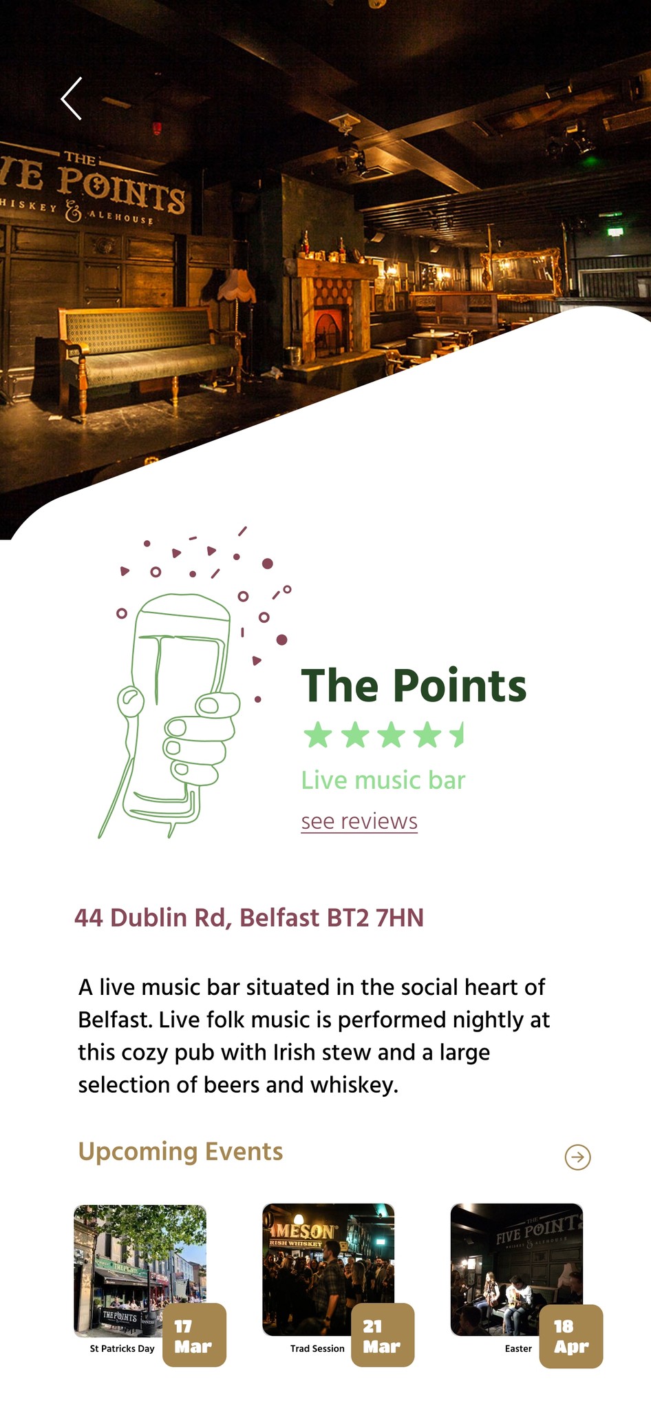
I created my final wireframes on Figma, using all the components I had been working on before this stage. This included colour, imagery, typography, and my illustrations. I was constantly referring back to my initial wireframe sketches.
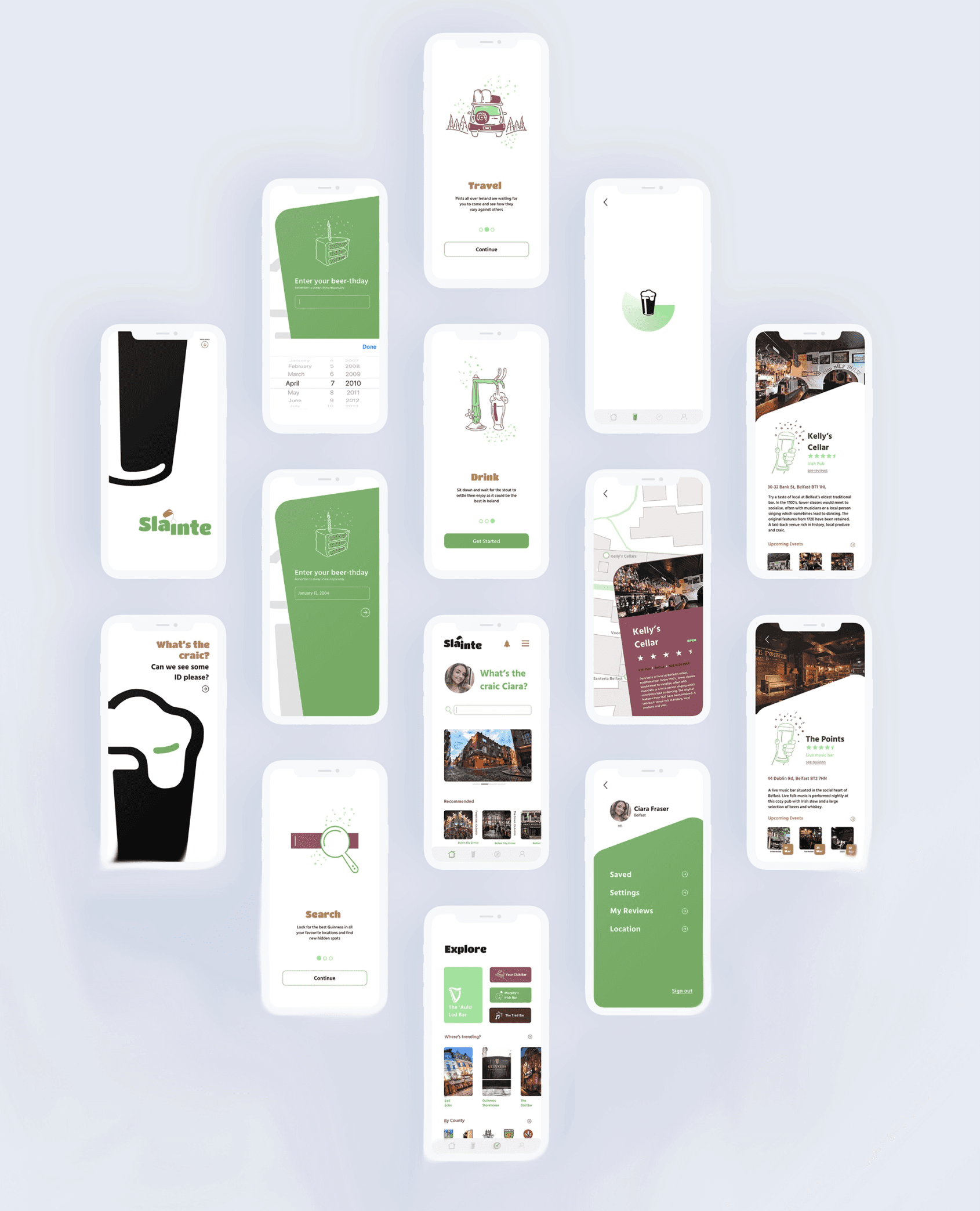
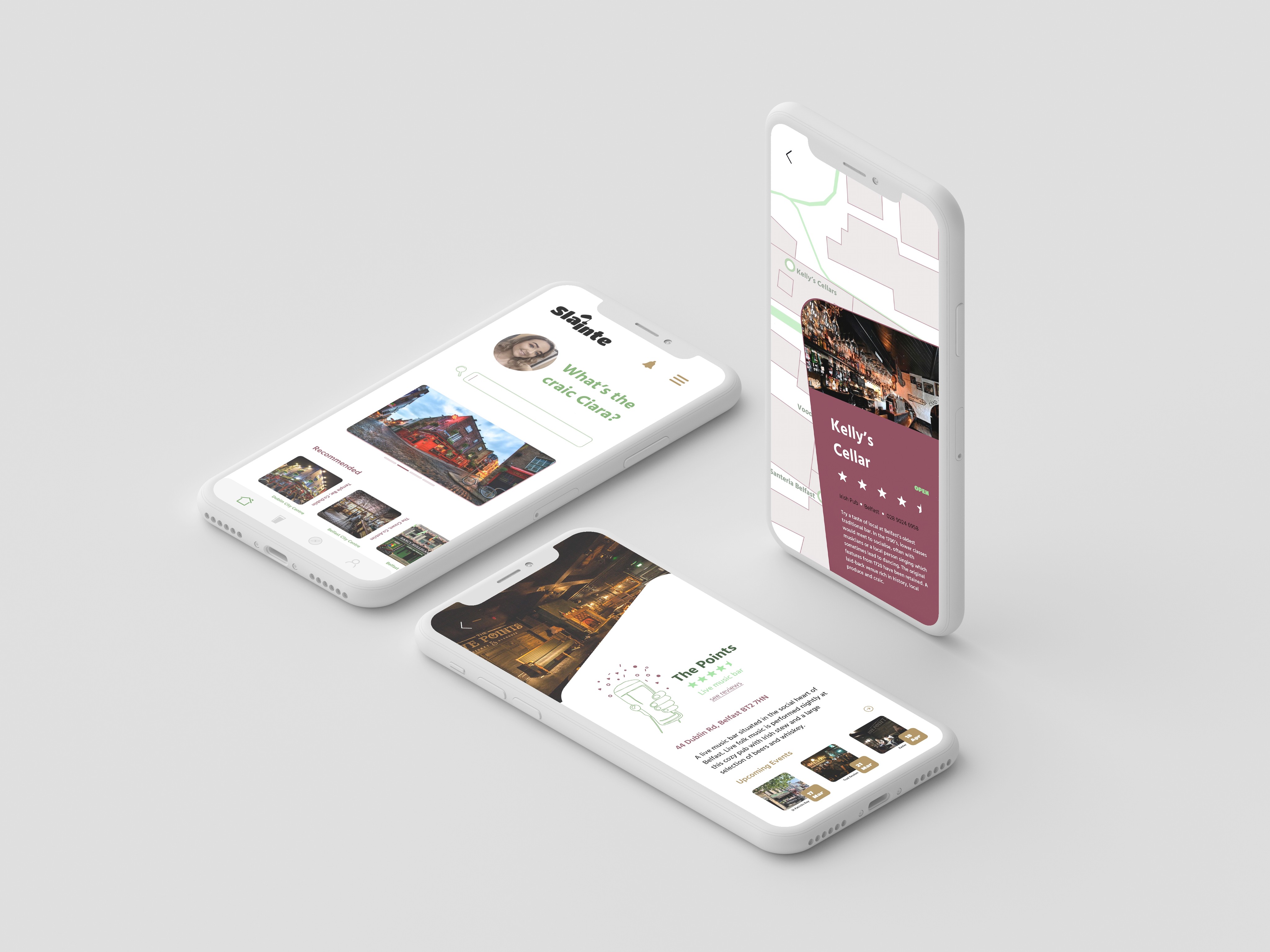
While at the beginning I found it challenging to narrow down what the theme of my app was going to be, I still enjoyed it as it allowed me to explored multiple options as I was given complete freedom on what my travel app was specifically for. Once I overcame this first hurdle and got into the design, I feel like I created a consistent app with an overall good luck. I challenged myself with including illustrations, and while I feel they do add to the app, I would prefer if some of them had a cleaner finish. While overall I am pleased with my app dashboards, one screen that didn’t turn out as I had hoped was the map screen. I would change the colours and add a bit more character to it to match in with the rest of the screens.