For my second project in the Designing with Content module, I was tasked with creating an UI interface for an autonomous vehicle. I was given the choice of how many and the type of screens I wanted to use, as long as it was presented as a prototype.
Work from 2022
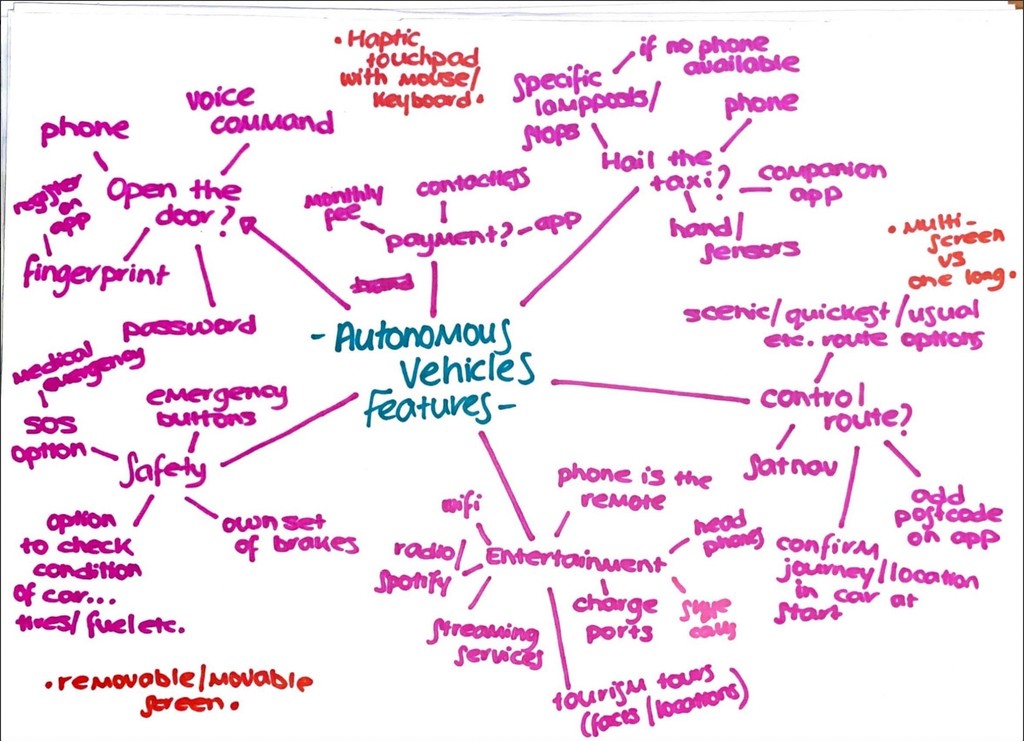
I took quite a bit of time to research into what autonomous vehicles are as I really didn’t have any knowledge about them when starting this project. I created mind maps of features based off images as well as looking at the different levels of automation and the differences between autonomous and self driving. I felt this was important as I would have found it difficult and unsuccessful to design for a product I know nothing about.
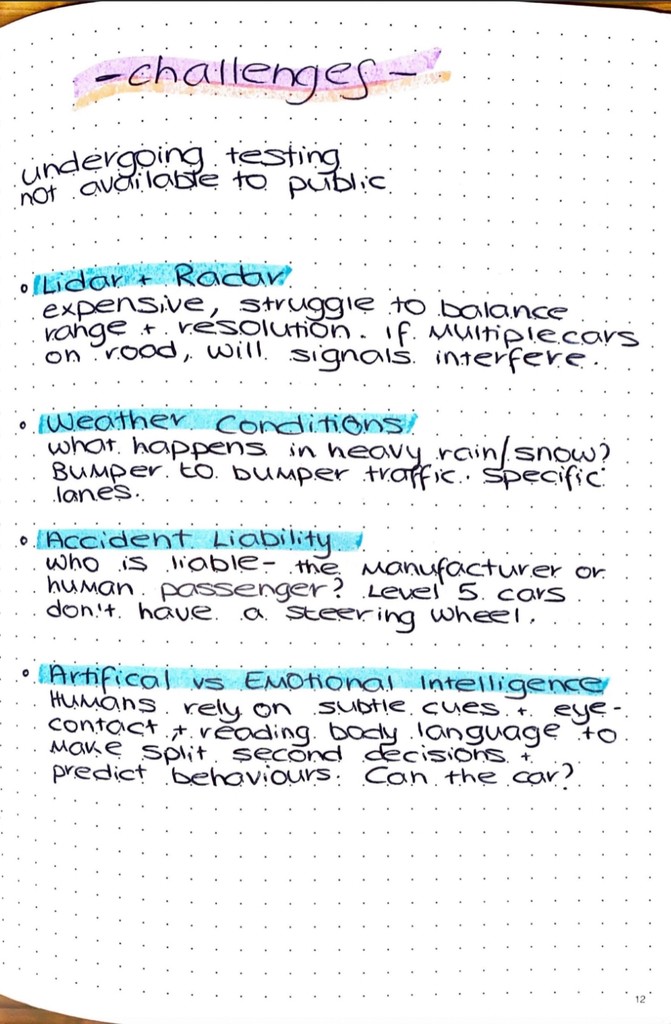
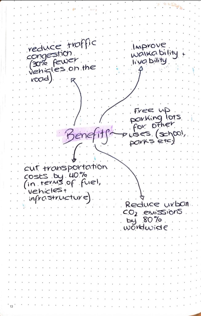
During my research I found a common them which was that autonomous vehicles face numerous challenges, on and off the road. So I decided to document both the challenges and the benefits of the vehicles. My plan was to use these as guidance of what to do and not do in my design, as well as see if I could create a design that could maybe reduce some of the challenges.


Taking the knowledge from my initial research, I started my design process by thinking about what problem I could solve with my design. This led me to taking a different approach with my user persona where I gave each persona a challenge they had to overcome, which the autonomous vehicle would help with.
I built user stories and storyboards around these user personas, which was very helpful in helping me get into the head of the users and visualise where my design would come into play within the user’s life.
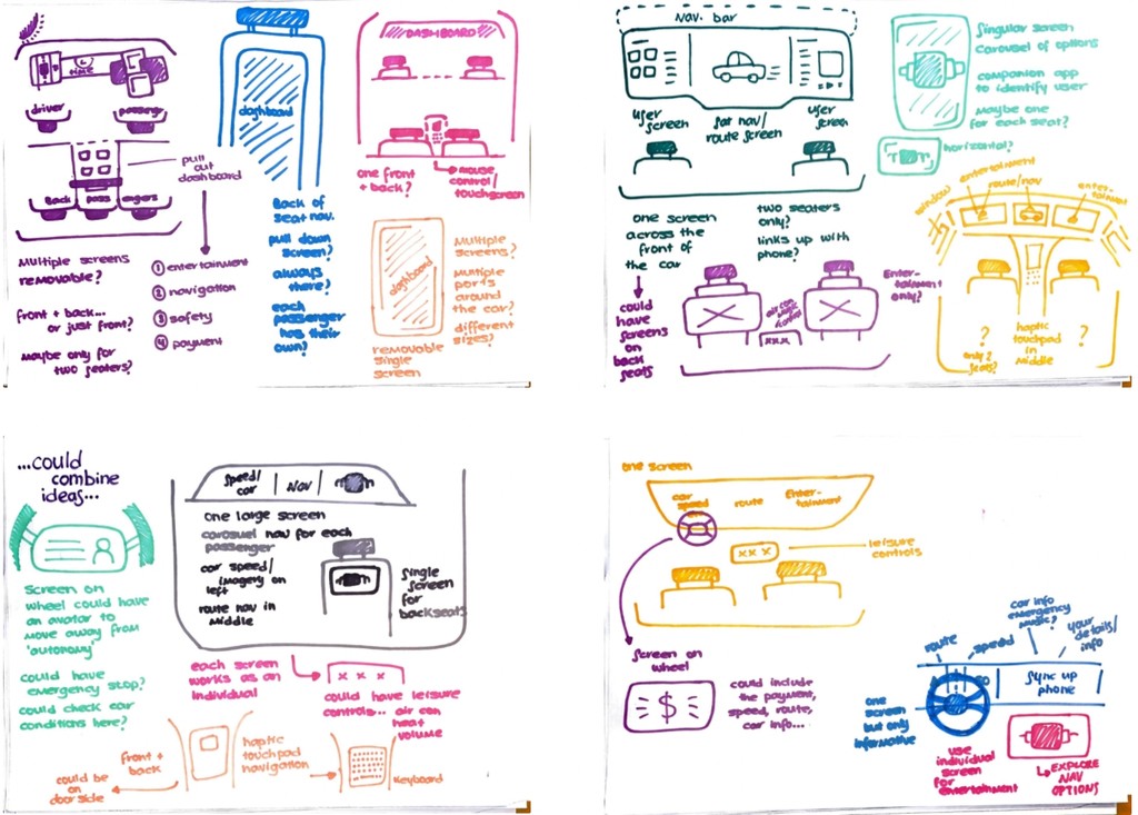
Rather than jumping straight into wireframes I created quick doodles of autonomous vehicles based off of images and concepts which had features where I could see my design working. I took these drawings and thought what would happen if I combined a few of these and come up with new ideas. This helped to get ideas going in my head, and acted as a reference point for when I created my wireframes.
When I was in the middle of the digital development, I felt I hit a wall when it came to my design, so I decided to take a step back and rethink to see if I could get any other ideas flowing.
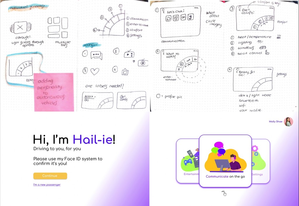
So I went back to my sketchbook and took a different approach of individual screens which would be located on the back of the seats. My aim was to create a carousel/scroll effect which would act as a menu for the users. However, when I digitised them and received feedback, I felt my original design was stronger in terms of being a more modern and forward thinking concept, so I decided to go back to it. However, I took some ideas from me second design with me and incorporated them within my first design.
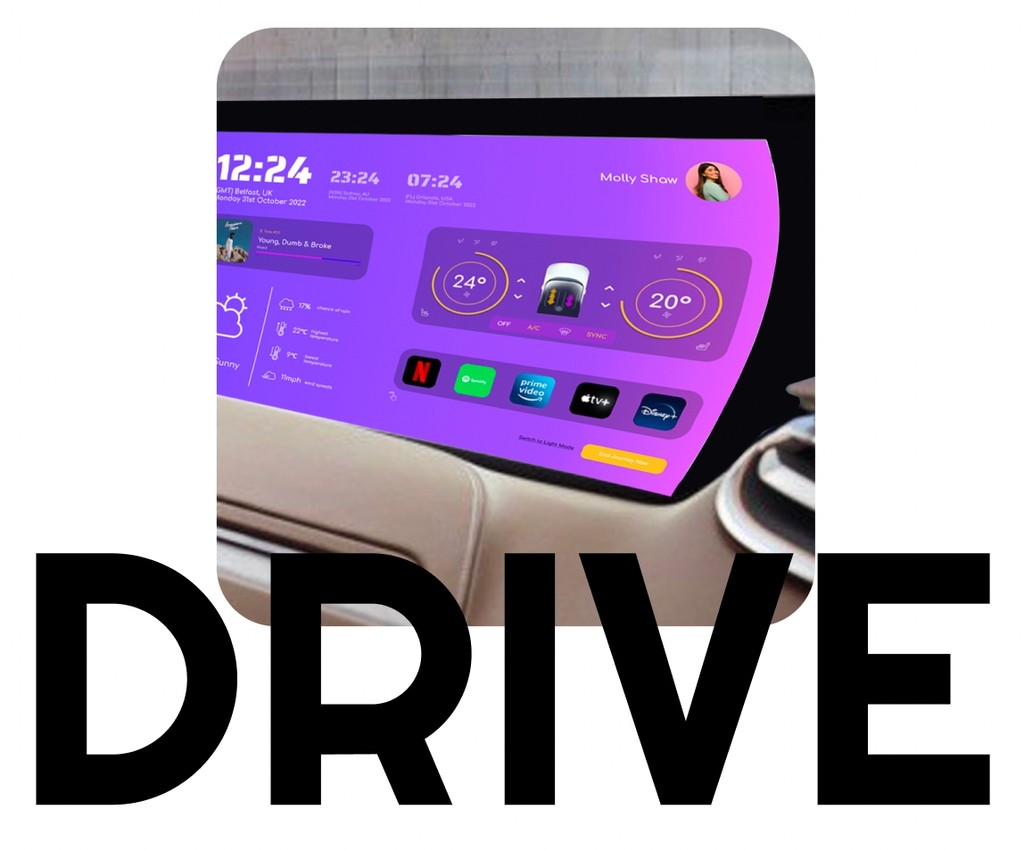
Once all my ideas were down on paper and sketched out, I moved to Figma to start to build digital wireframes of my dashboard screen. I created a five colour set which would be the basis to bring my ideas to life. I felt it would work well with a dark mode screen, as I feel this is more suitable for a car dashboard. I also began to consider the typography and a small brand to compliment it.


I took the screen in small sections as it was the first larger screen I have worked on. I felt using cards would be the best option as it helps divide up the large screen, making it easier for the passenger to take in all the information. The dashboard follows a system of if you click on the card, it will enlarge, providing more information for the user.

The concept of the prototype of that the user will use their Hail-ie app to order a car and when it arrives it will use facial recognition to register which person is in the car. It will then tailor the experience to them by logging them into their streaming services, music, messages and phone calls based on their Hail-ie account. There is also voice-recognition where the passenger can make and receive calls by asking ‘Hail-ie’ to do so.
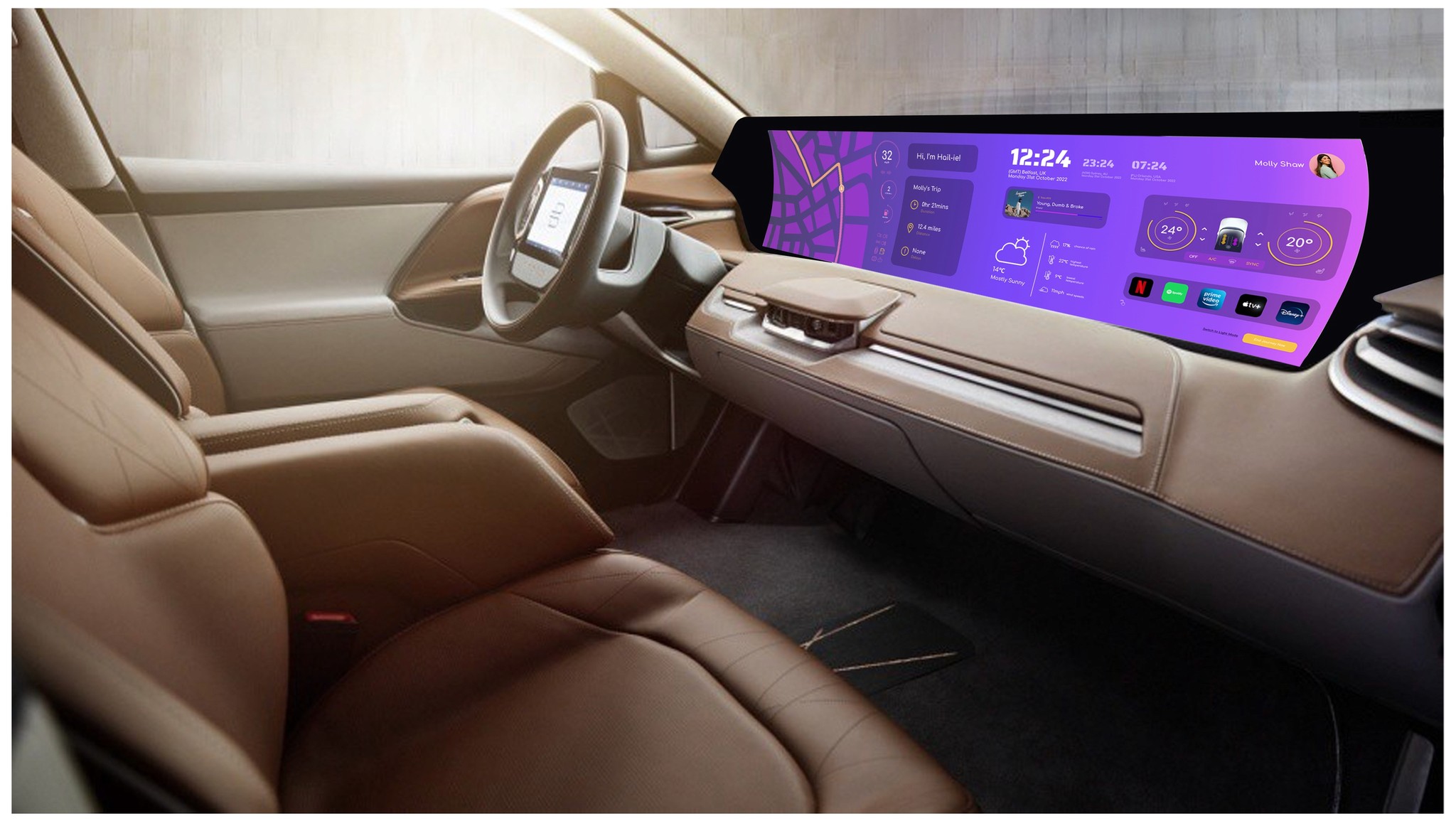
I really enjoyed working on this project, particularly working with a larger screen and having multiple elements combined on one screen. I feel my colour scheme is effective for a car, whether that be suiting daylight or night. Also I feel my layout is easy to understand and users can easily see all the different sections. However, I do feel like I could alter some of the size and thickness of the icons so that they would become more visible to users. Overall, I am pleased with the final outcome and I have learned a lot in terms of designing for different screens as well as new technology. While there are some things I would still change about it, from where I started and the challenges I faced during it, I am happy with how the final screens worked out.