My final project of the Designing with Content module was to created any interactive product based on Sustainable Development Goals. We had a lot of creative freedom in this project, as long as it was targeted towards either ten year olds or adults.
Work from 2022
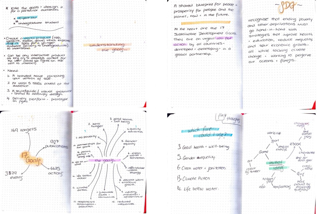
This topic was something I had never heard of prior to this project. So I carried out quite a bit of research into each individual goal. I still felt I need more information on the topic, so before starting any ideas, I noted down down the key parts of information about the Sustainable Development Goals. I specifically looked at the message behind the goals, as well as the overall aim of the United Nations in creating the goals.
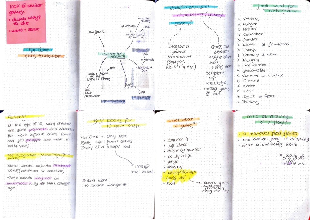
After creating a mind map of my initial ideas, I knew I wanted to focus on a product for the ten year old age group, so I thought about ideas that would appeal to them. I felt I could take a more illustrative and colourful design approach. I thought about taking the goals and creating a digital game. I looked at digital games that are aimed at that age group, as well as thinking about board games. I also considered creating an ebook with each goal becoming a character within a story.

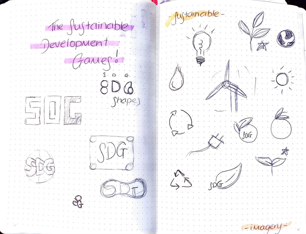
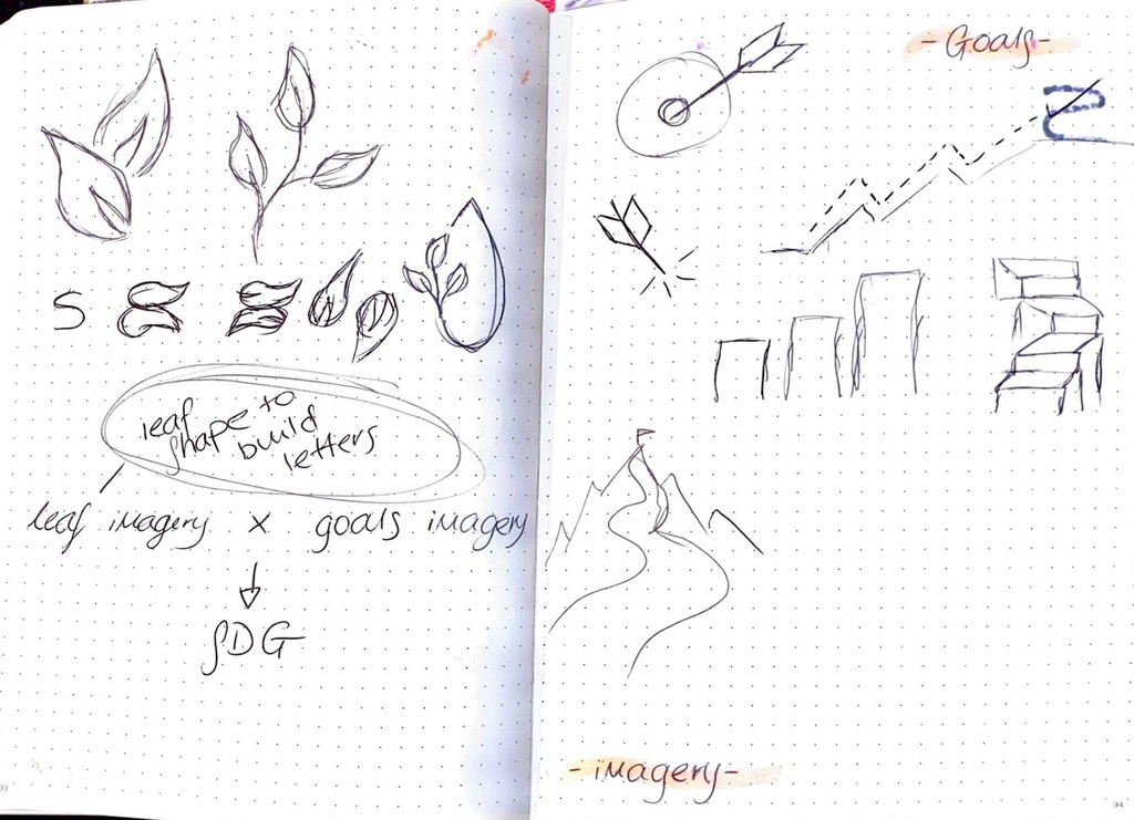
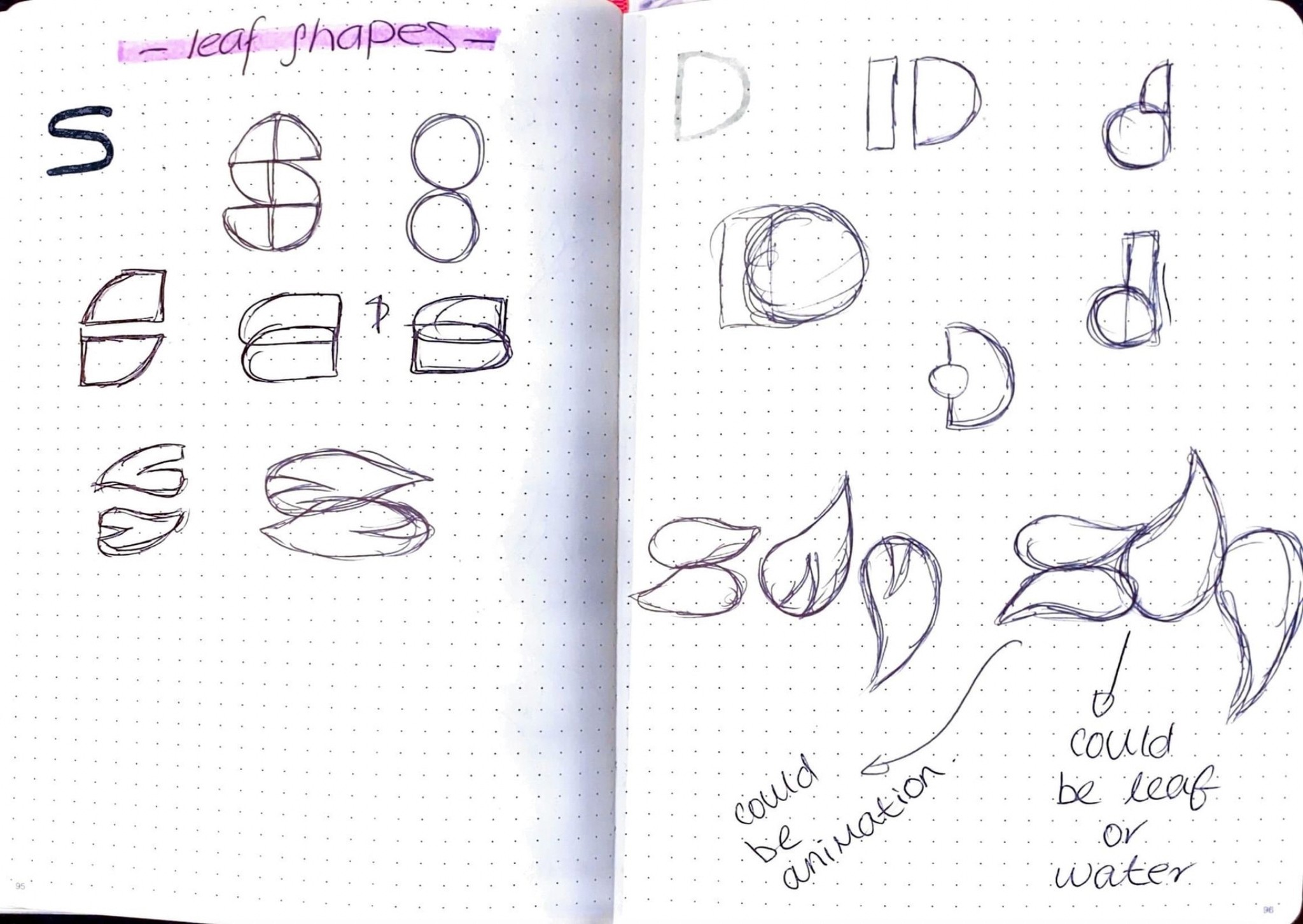
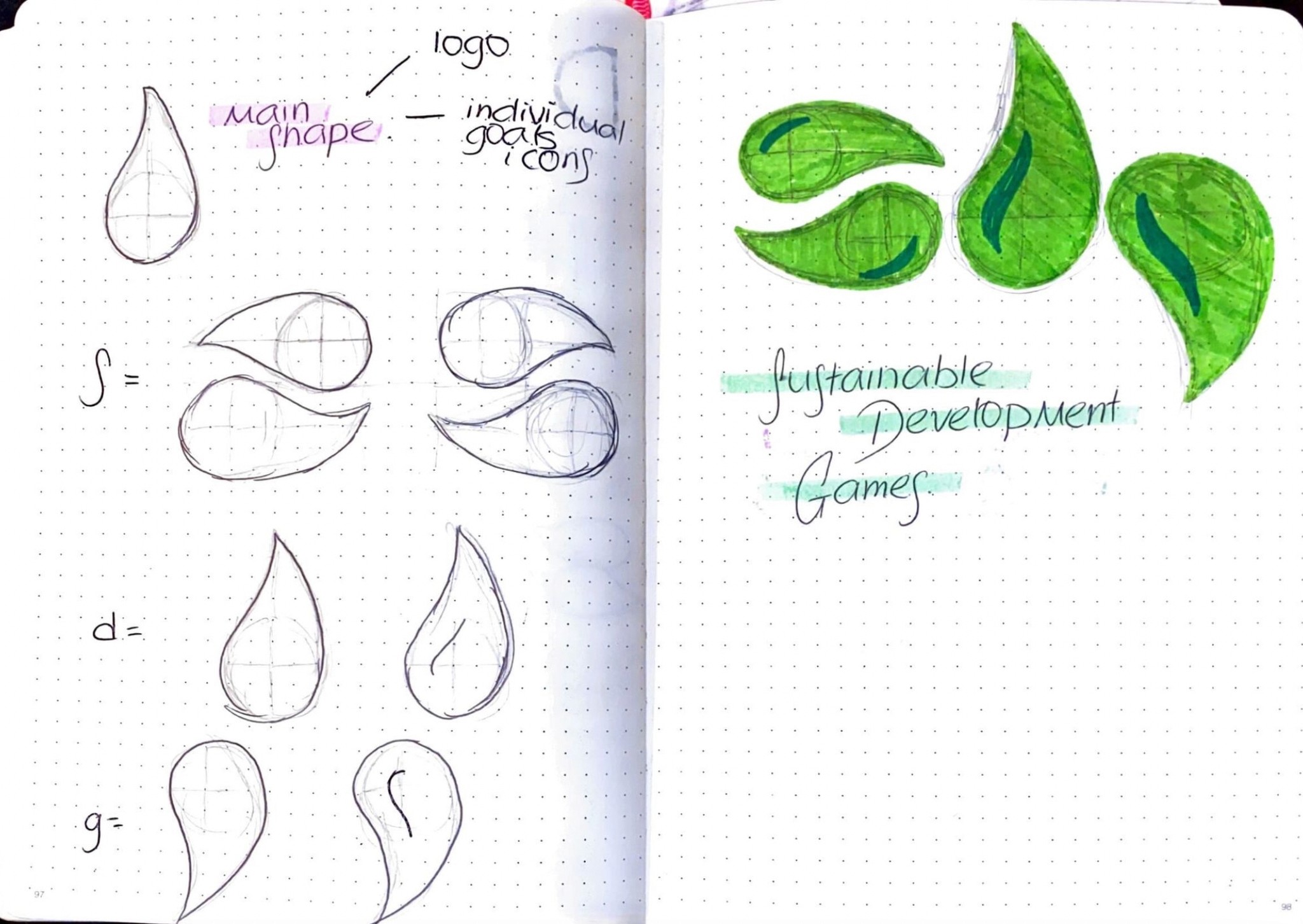
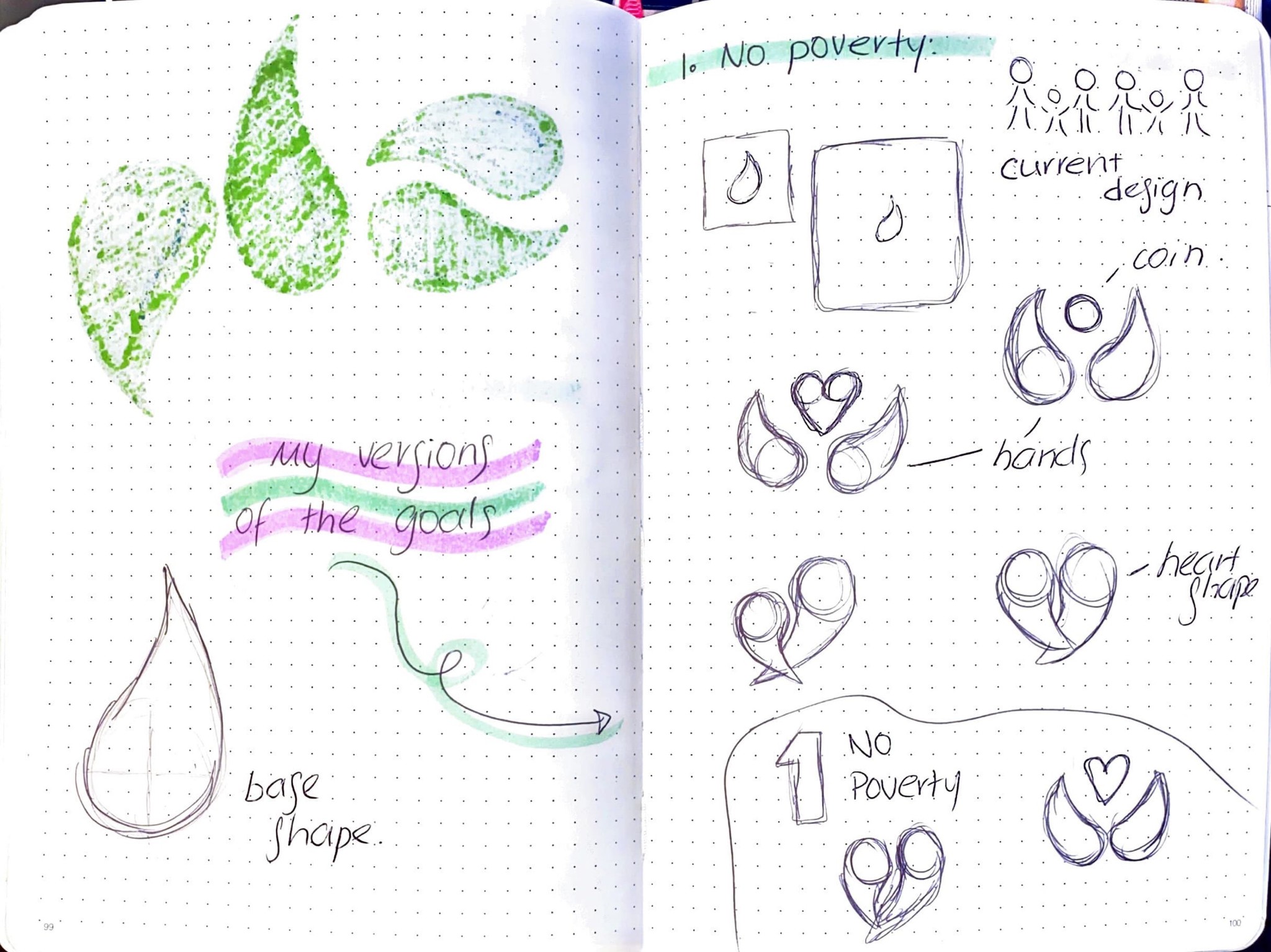
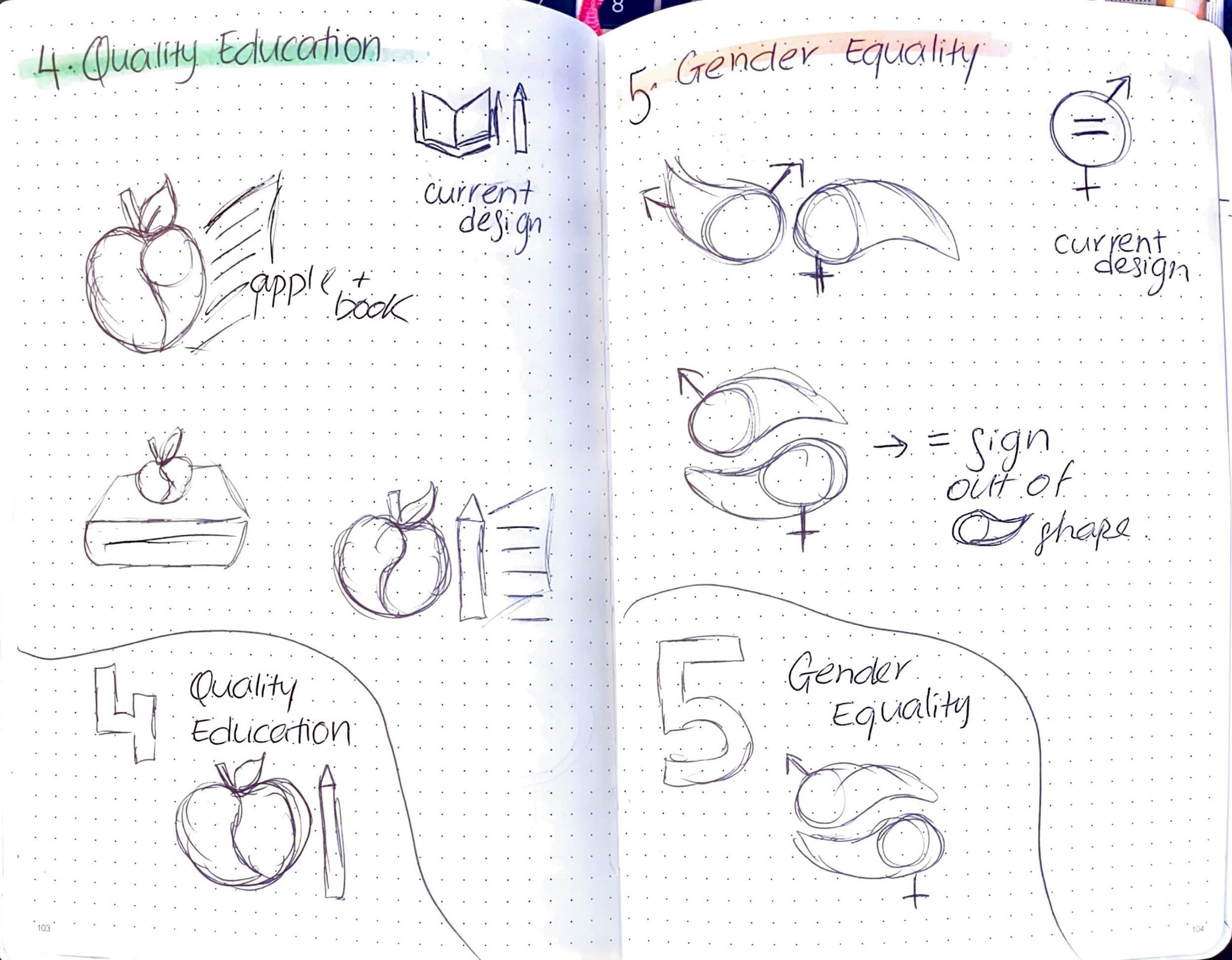
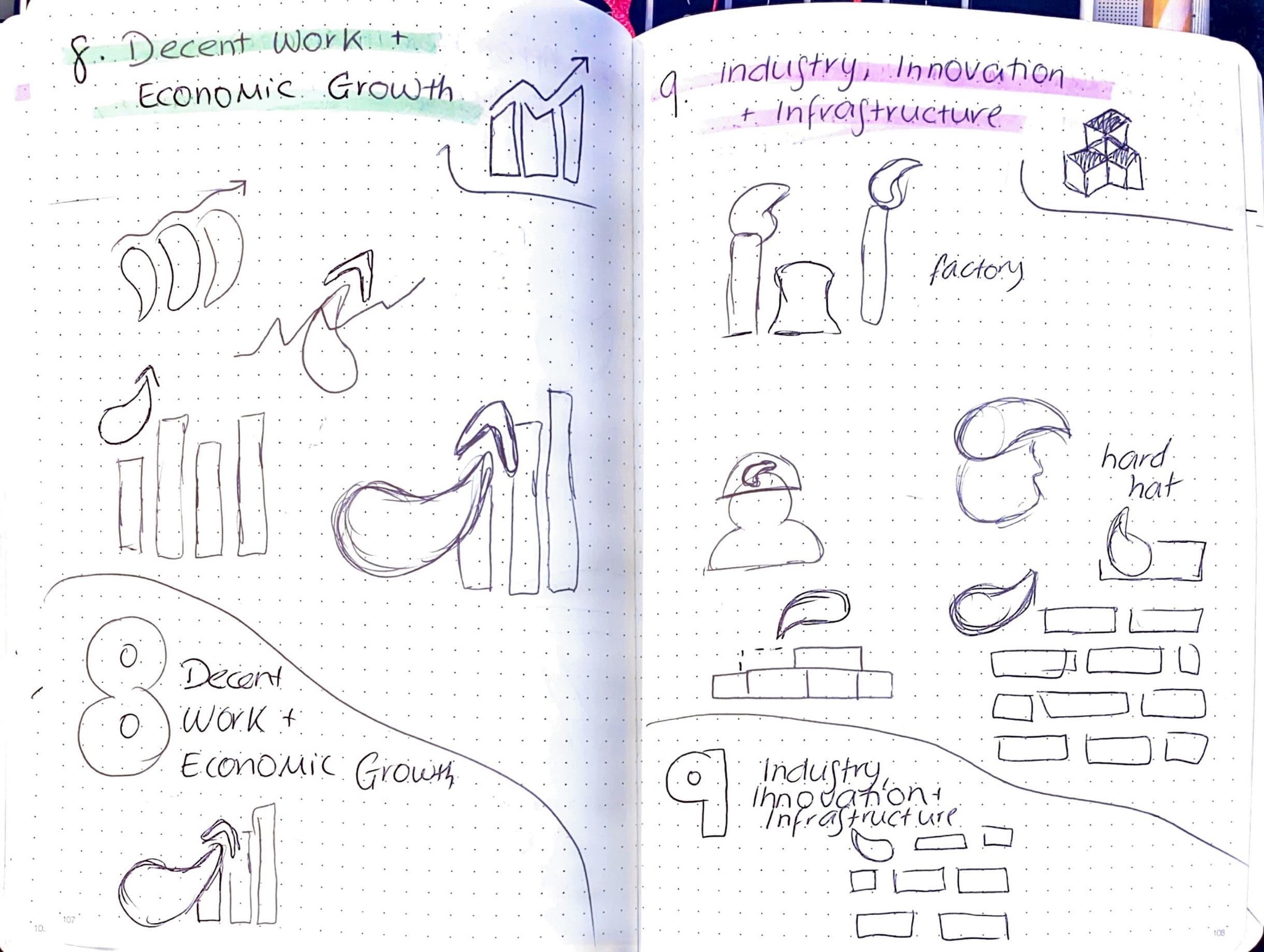
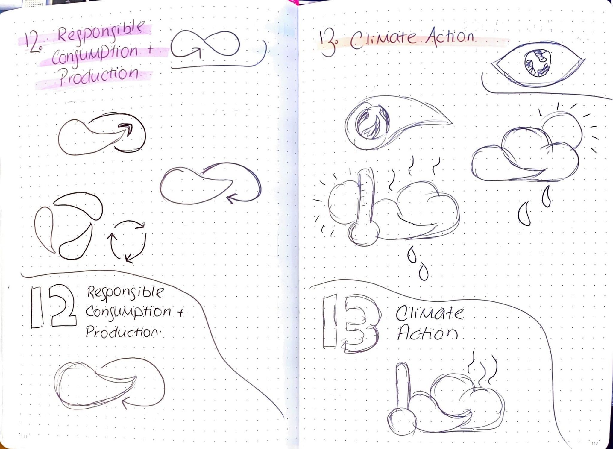
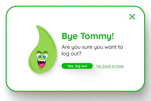
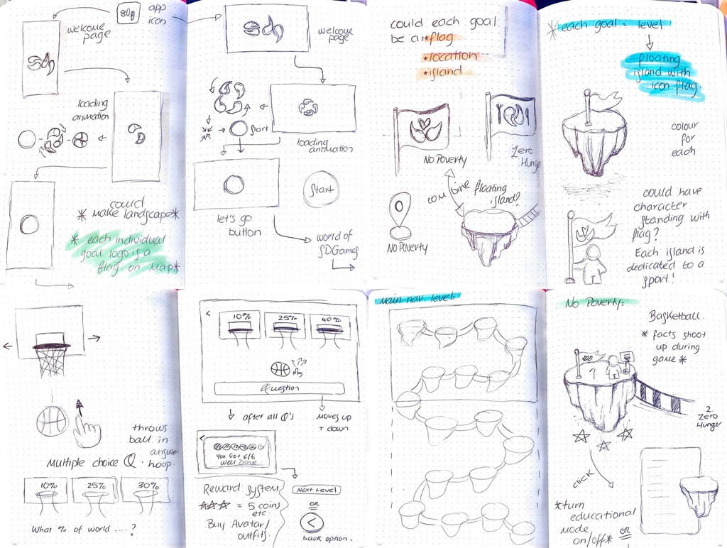
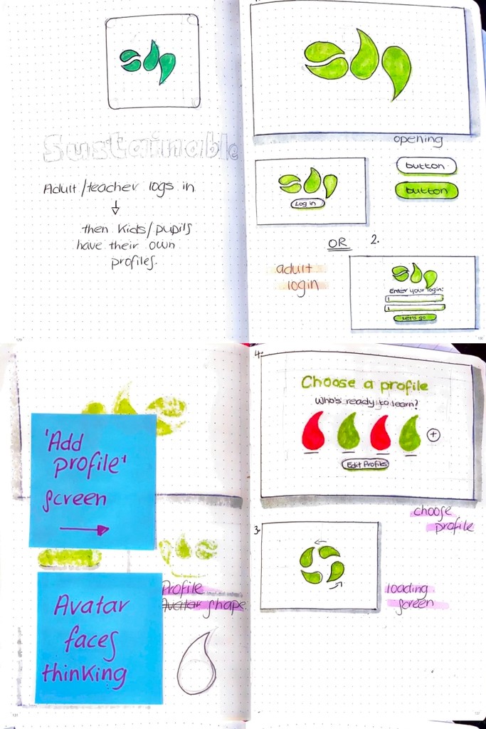
This part of the process took up a long period of time as there was multiple aspects of the UI I had to consider. I was surprised with the number of ‘layers’ there was within my idea and how many different screens I would have to consider. I began with some quick sketches, taking visual inspiration, and getting my ideas down on paper. It was at this point I came up with the name and logo of my game, which I then thought about incorporated into my own versions of each goal. I felt using the leaf shape would a good way of creating consistency across the screens.
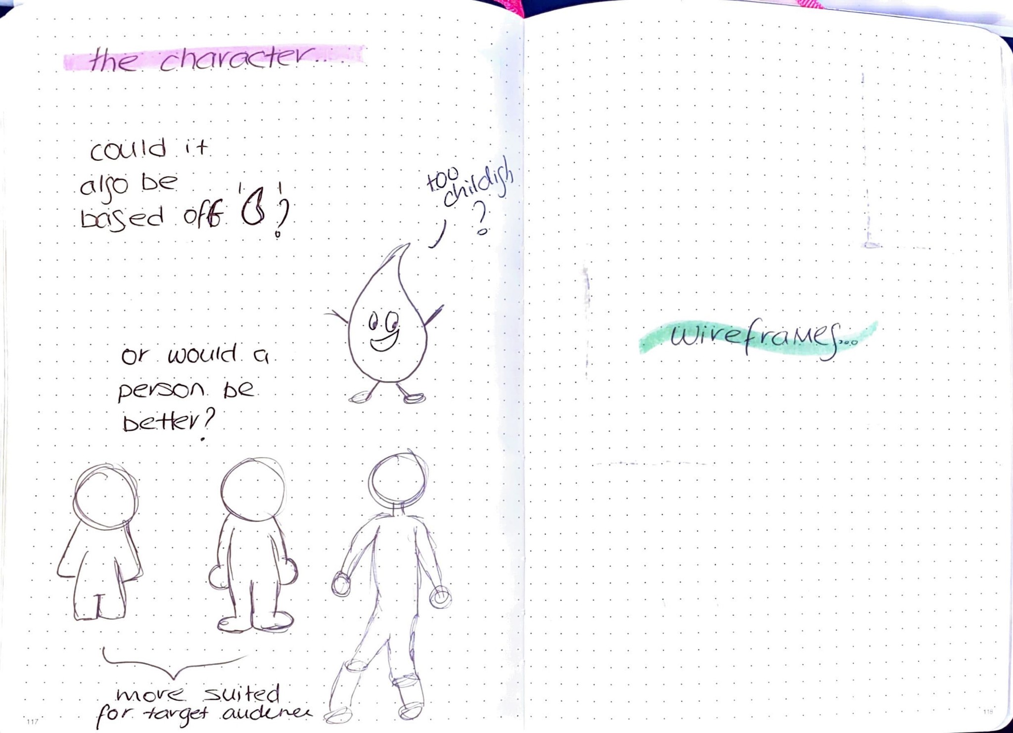
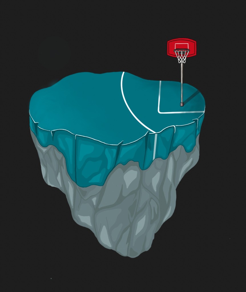
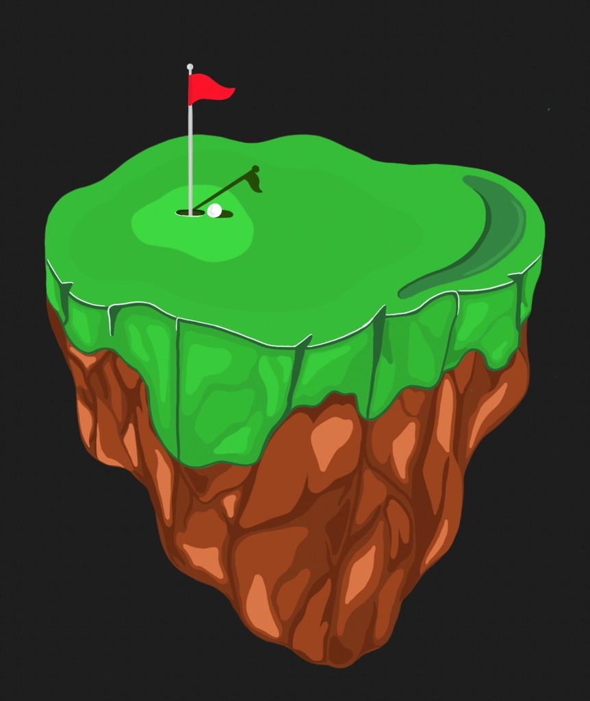
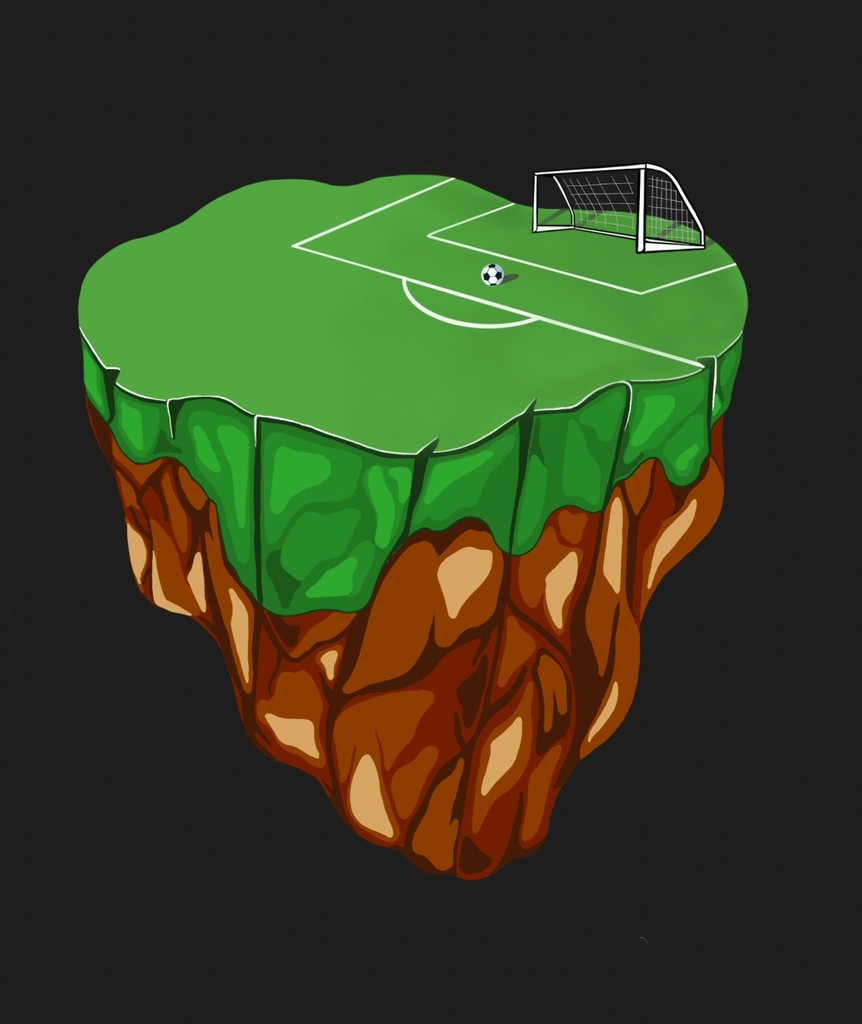
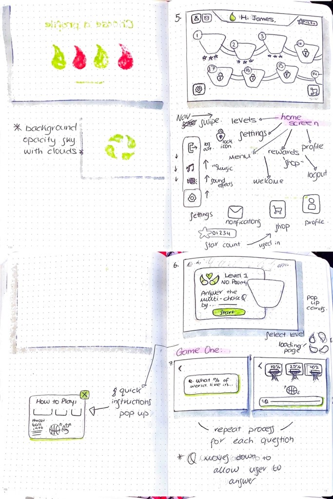
I considered how each screen would look with a number of quick sketches initially, including the opening screens as well as how each level would look. I came up with the concept of each island being a goal, linked to a sport, when I was watching Avatar. So I took these ideas and creating more detailed and structured wireframes, as well as a user flow, which would be the basis of my digital development.
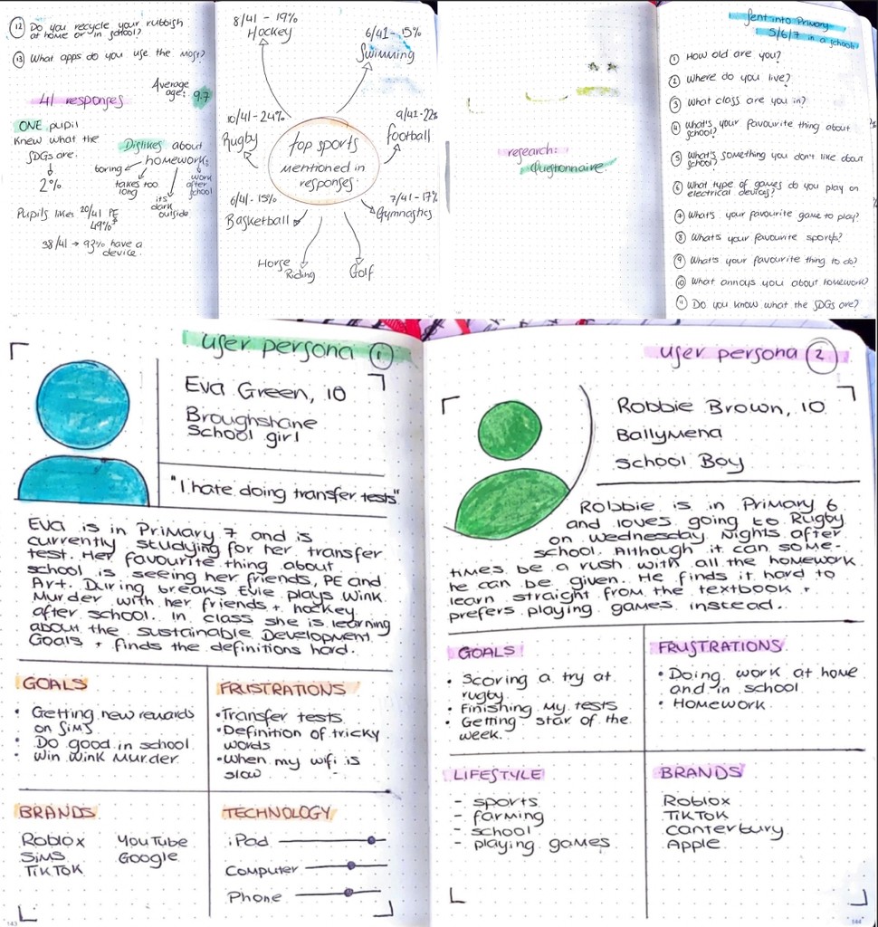
When it came to understanding my users, I created a questionnaire which I sent into three primary school classes. I wanted to gain an insight into what sports they like, favourite subject and if they knew about the Sustainable Development Goals. I received 41 responses and a lot of valuable knowledge, which I used as the basis for my user personas and user stories.
I collated all the visual elements of my game together to allow me to see if they are consistent. While I had created brand guidelines before, I wanted to make sure I understood what was needed within a style guide so I quickly researched into examples and what is included, as well as what I would put into my own guide.
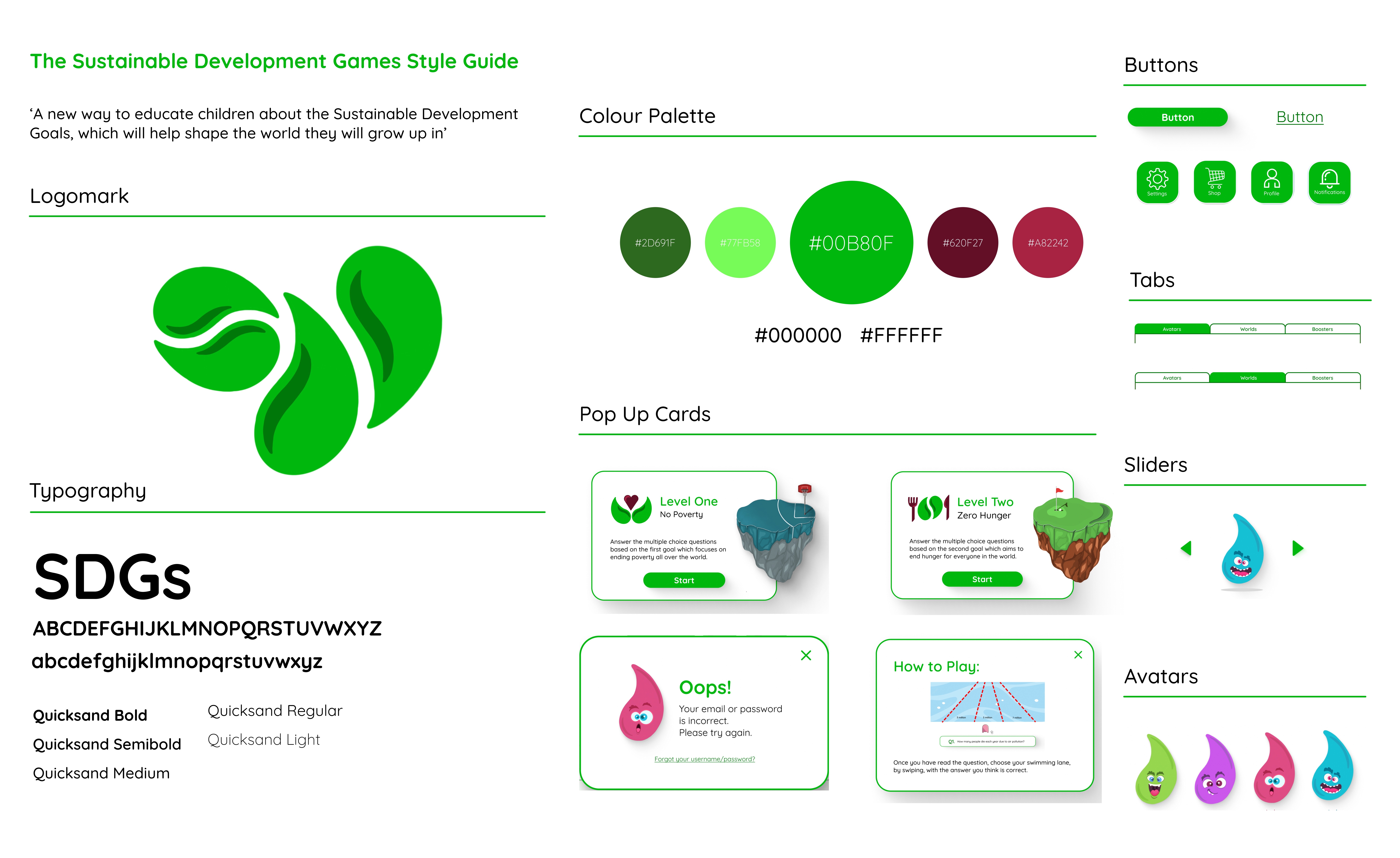
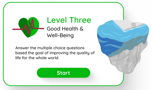
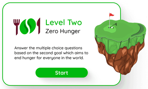
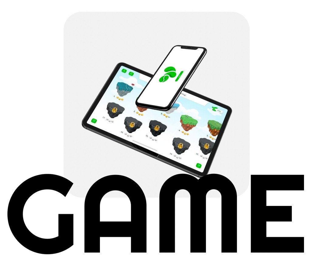
During this process, I used both Figma and Procreate to make my design digital. Before I could start building my screens, there was a number of elements I had to create so I could build the home page and levels. The islands were very time consuming and I wanted to include a reward system so I also had to create the visual elements like the stars. As well as this I had to consider what the avatars would look like. I wanted to use cards as a way of presenting information, particularly choosing the level. So I used my illustrations and Figma to create these.
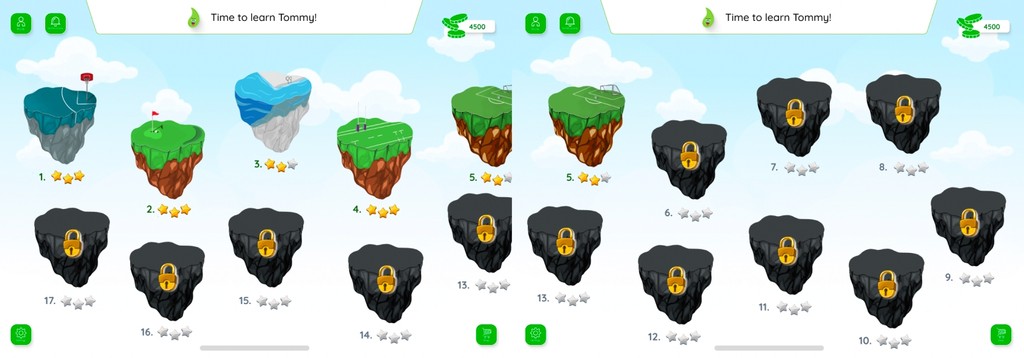
Once I had created all of these I moved to building my home page first. I looked at the positioning of icons like settings, icons and coins, as well as personalising the screen with using the users names and avatars. It was trial and error with the positioning of the islands trying to get them all to fit in, but as they are floating I felt there didn’t need to be a lot of straight structure across the page.
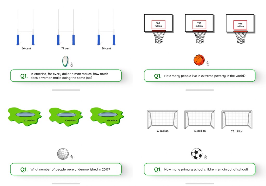
For the game screens I decided to follow a rule of three, where each round would have a question based on the goal and then three possible answers, which would be visually linked to the sport I had given to that level.

Once all the screens were created, I used Figma to create my prototype. It took This is one of the first projects that I have used this tool so it did take me a while to get to terms with it and there are some points during the prototype where there are animations happening that I didn’t mean to create.
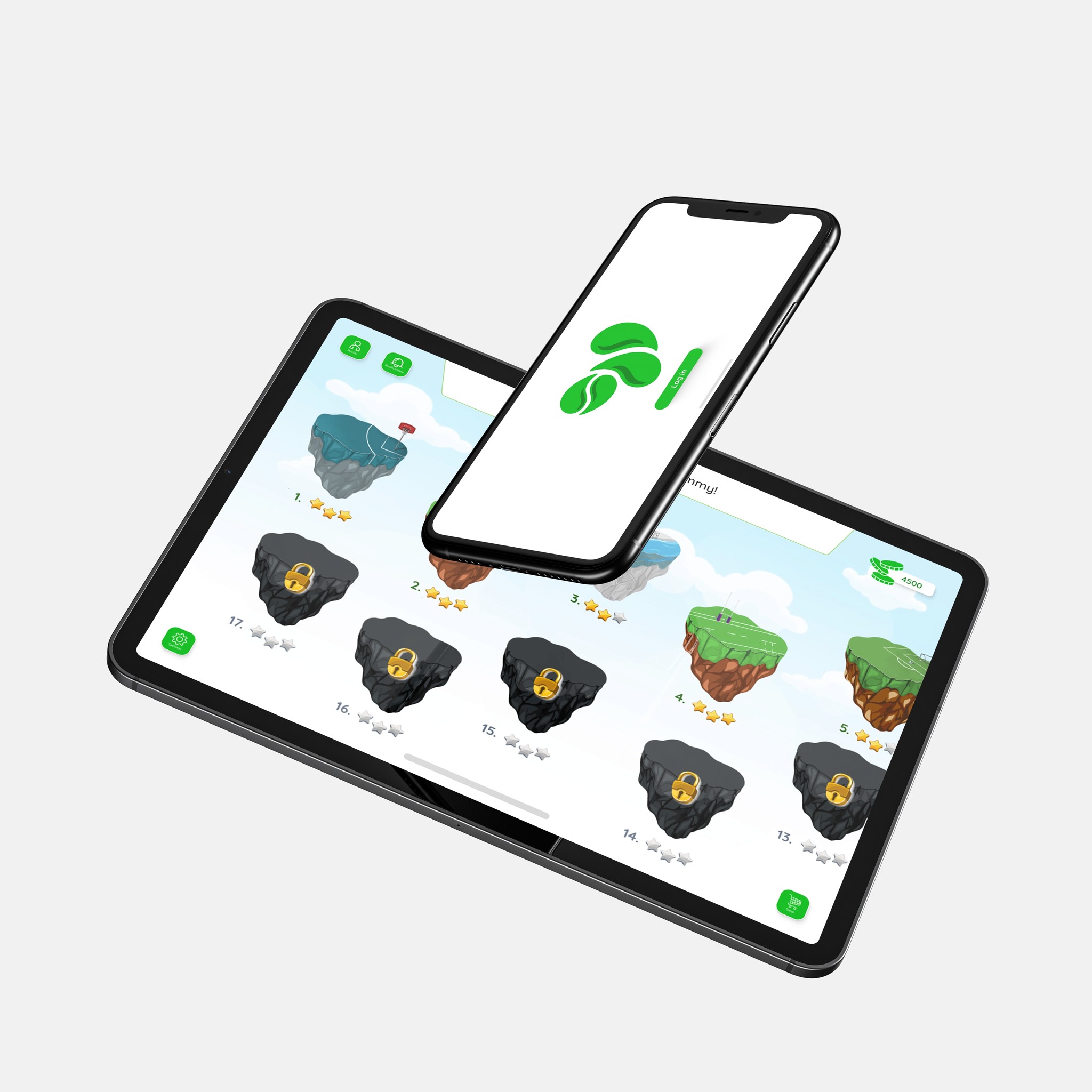
I really enjoyed the different approach the project brought me on, exploring illustrative elements to prototyping. I feel like my design process allowed me to create a successful end product which would act as an educational game for children in primary school. I am pleased with the overall visual look of my screens and I feel I created consistency across the board. Pulling such a large area of information into a smaller, contained screen was quite challenging at the beginning as I had to make decisions quite quickly in what I had to do. There are some elements of this project that I found challenging which was I could have planned my screens a bit better by making more sketched wireframes so I was more prepared. This would have been helpful during the prototype process, as I found it very time consuming working out which screens connected where. Overall I am pleased with my final outcome, I feel I created a consistent set of visual elements across the game, but I am aware there are areas which do need improved.
