Work from 2021
For the first project in my second year of Interaction design. We were tasked with creating a smartwatch UI, where we could choose our own topic or theme. We had two weeks to research, brainstorm, develop/sketch, and then present our final screens.
To begin I researched into the world of smartwatches, having very limited knowledge and experience with them, so that I had a good understanding of the technology before I started my designing.
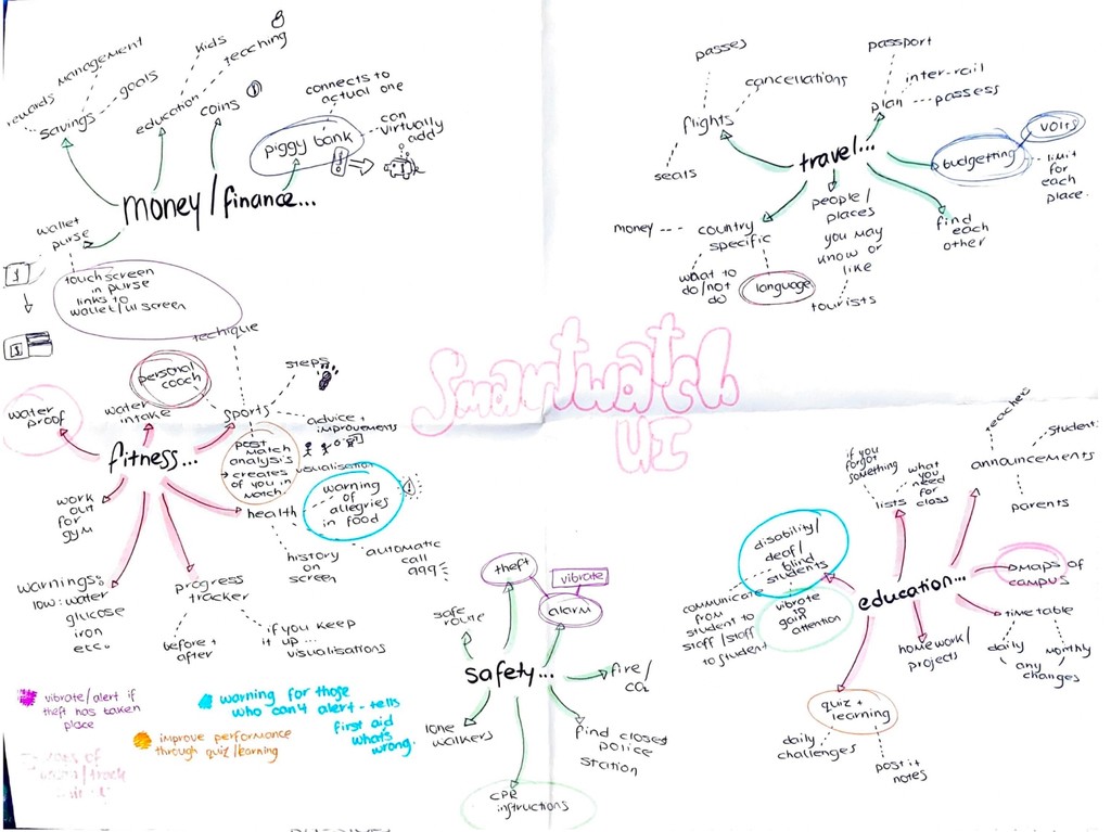
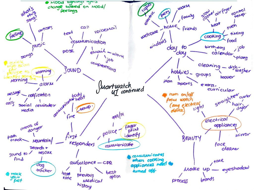
I began my usual process with a mind map focusing in on five possible topics. With the app design being able to hypothetical or designed for the future, it opened up a range of options.


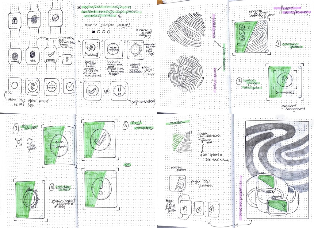
As this was a quick project my sketchbook wasn’t that extensive. I moved quickly through the design steps, writing down my initial ideas on visual design and names, which I would refer to later. However, I was still able to create an effective brand and wireframes in this time.
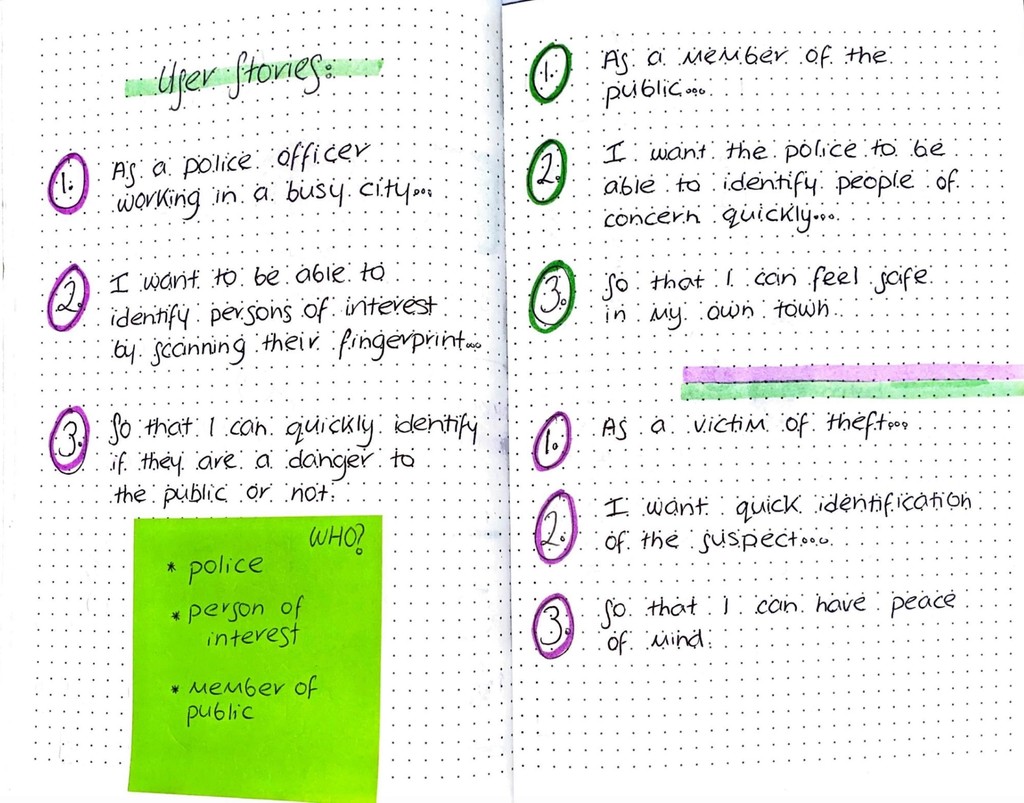
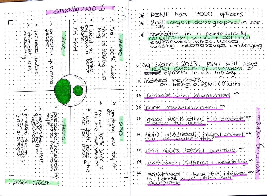
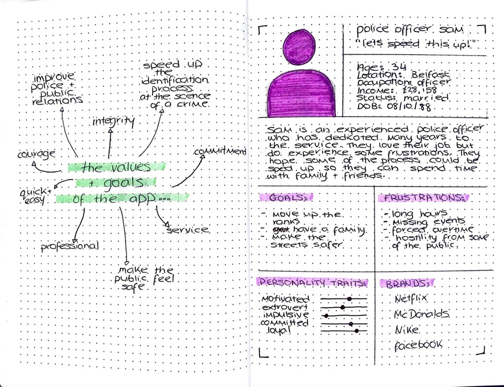
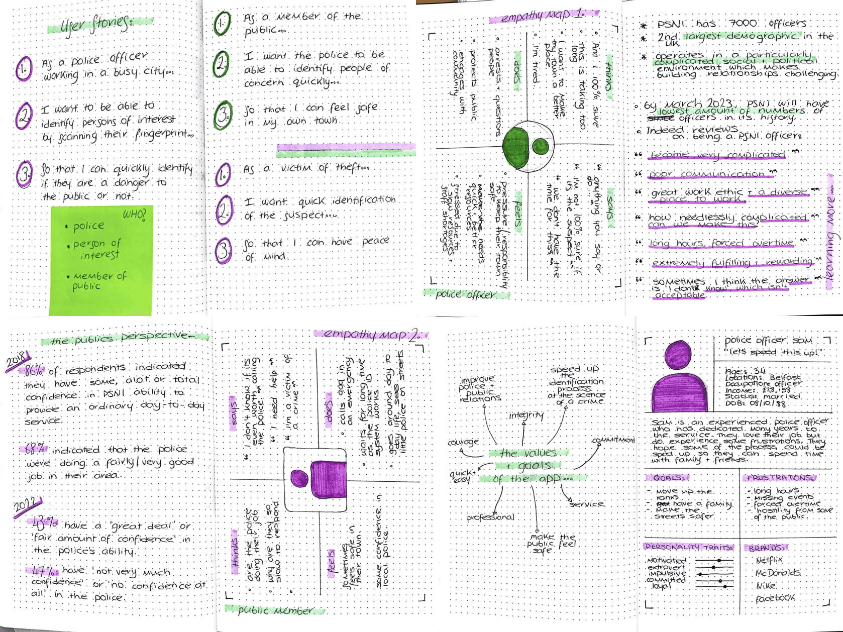
With the aim to understand my users, I created some user stories, empathy maps and carried out some subject specific research into the police service.
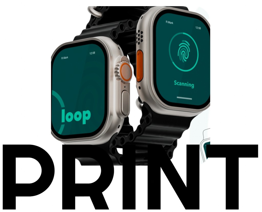
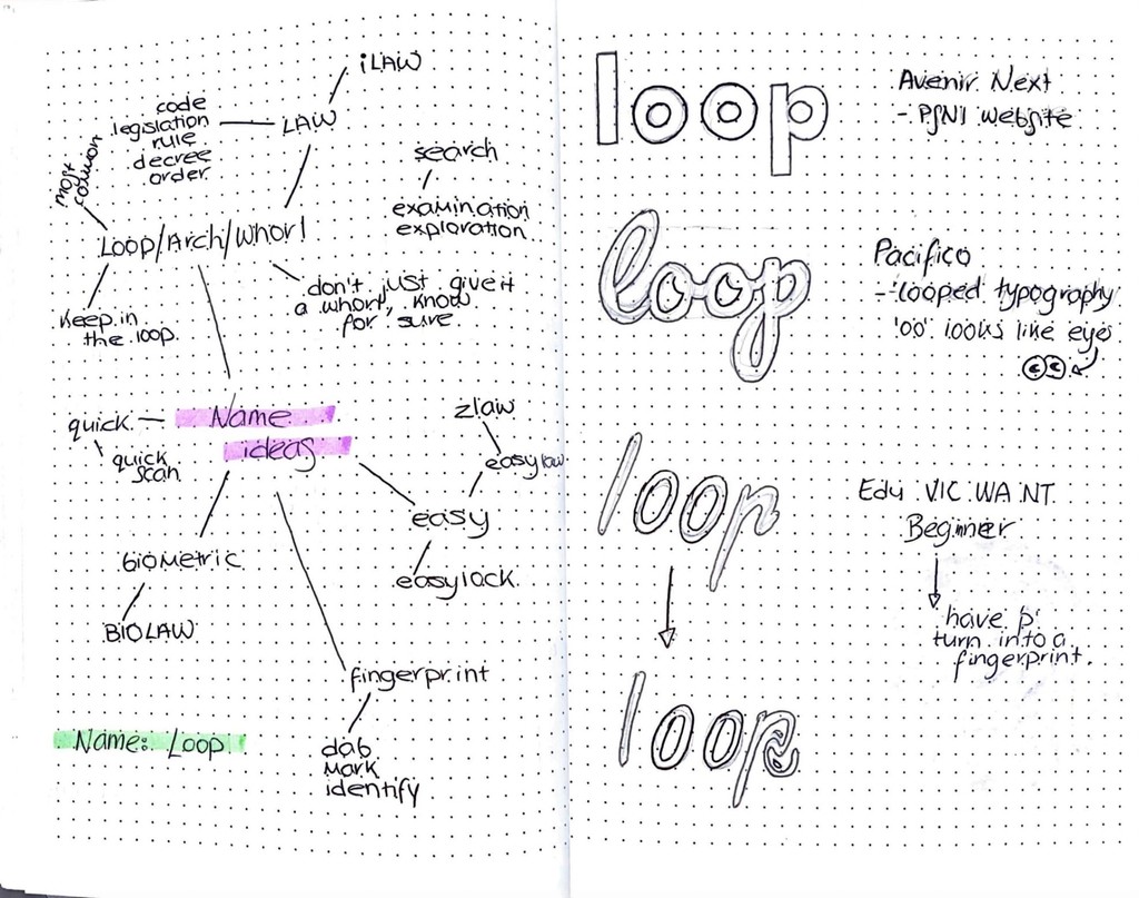
The name for the app was my next step which from the very beginning I wanted the name to have a link to the three types of fingerprints. I explored simple and more complex options but felt the simple name of ‘Loop’ would be best. I also looked at possible typography choices.
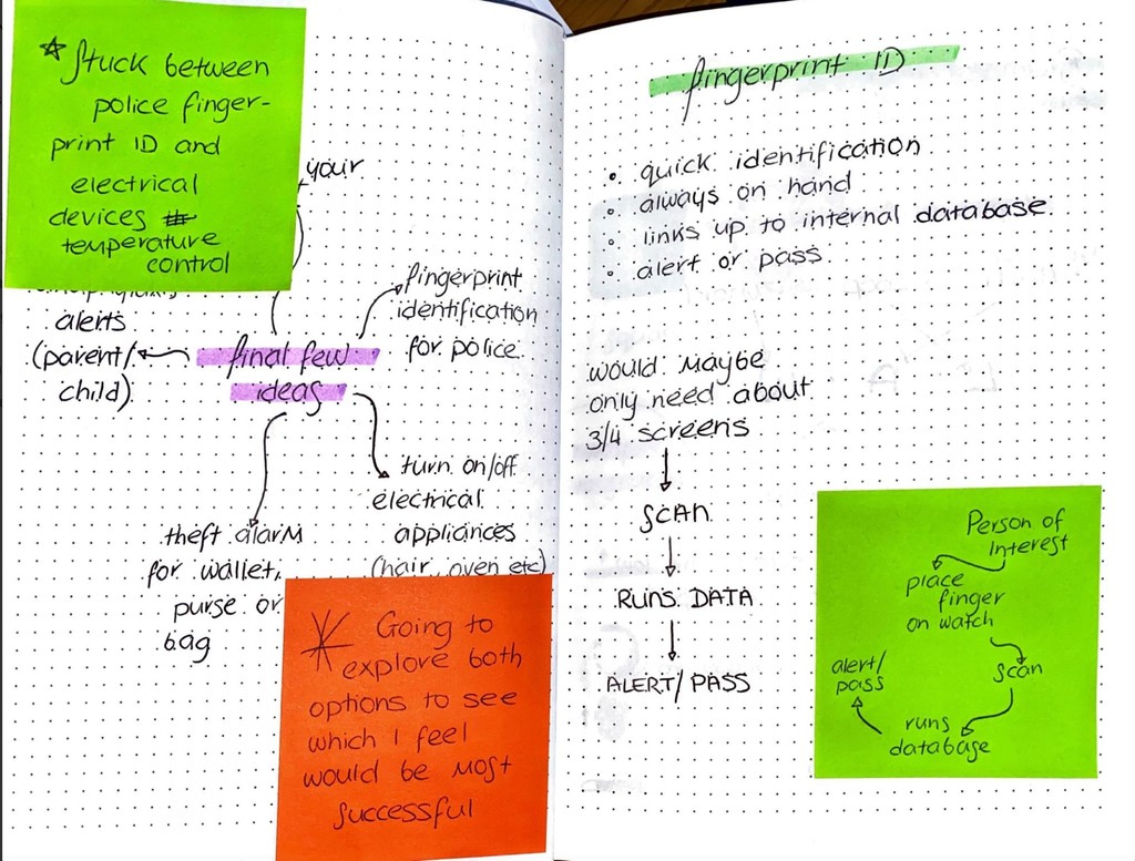
I created some low fidelity wireframes exploring different options for how the screens could look. From here I chose which screens would suit their function best but also create a cohesive design. With these decisions made I created higher fidelity wireframes showing the steps the app would take. At this point, I also considered how I would present the final outcome on one page.
Due to my lack of experience with Smartwatch UI before this project, I researched into the Applewatch UX guidelines. This included the size and placement of components, as well as what you can and can’t do.
Since my idea was related to the police service I looked at the PSNI website and felt using a similar colour palette would help it look realistic and that it links visually back to the PSNI brand.
I looked at the loop fingerprint pattern in detail as it was a main focus for my app, being the main inspiration for the name and pattern in the app screens. While it was a quick project I did look at the details including building a small brand, the placement of times and colouring.


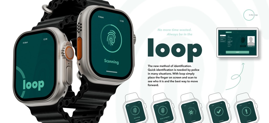
Using my smaller mockups, I put them all together and created a high resolution mock up which I used to present my final outcome. Keeping in theme with the loop fingerprint, I used a lower opacity of one of my drawings and used it to create a pattern in the background.
One aspect of this project I enjoyed most was how it was something completely new to me, as I have never used a smartwatch before. I initially found it challenging to pull back my ideas and make them simpler so that it would suit the smaller interface. However, once I figured this out I feel my final designs are effective in their simplicity, and the function of each screen is clear. This was something I was concerned about at the beginning, that they may be too simple, so I created the companion app which the officers would use on their tablets. I found the time constraints in this project actually helpful as it forced me to not get stuck on one aspect of the process and back my ideas. Moving forward I might even give myself some challenges in creating designs in a certain length of time.